Show:
How to Create User-Friendly Navigation Options
February 8, 2021
 Web development
Your navigation structure is the heartbeat of your website. When people land on a page, they immediately orient themselves by looking for the navbar and familiarizing themselves with the different categories and possibilities.
The last year brought changes to the way businesses must reach customers. Even creative endeavors such as design are weighing a changing consumer landscape. The Adobe State of Creativity Report looked at more than 600 artists and designers. Around 76% of design professionals agree it’s harder to navigate the rapidly emerging and changing trends in visual culture.
One could argue that navigational hierarchy is the core of everything else on your site. It improves the user experience (UX) and makes moving through your site easier and appears on every page. It’s vital to keep it as user-friendly as possible.
You might be asking, “How can I make my website navigation easier?” Here’s how.
1. Aim for Consistency
Users love patterns in design. It helps them predict what comes next. There is a comfort factor in understanding a brand’s style and seeing it repeated on a website, social media page, and other places where the company image appears.
With navigation, you can be consistent in numerous ways. You want to place the bar in the same spot on each page of your site. However, you can also tweak it to have category headers within certain character length parameters and even similar language. Single-word tabs make perfect sense.
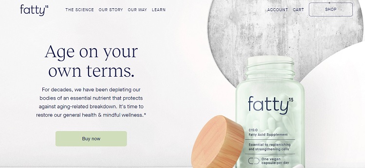
Fatty 15 is a supplement product. When you land on their homepage, you see the navigation horizontally across the top. As you surf through their pages, the navbar stays in the same location and the choices remain in the same order.
Note how most of the choices use two words, such as “The Science,” “Our Story,” and “Our Way.” The tabs also have a hover effect. As you mouse over each option, the color of the words changes ever so slightly so you can see that the text is actionable.
2. Plan Your Categories
Good navigation requires planning. You don’t want three dozen categories trailing down the page and distracting the user. Instead, think about the main four or five topics that everything falls under. You can always create subcategories as your site grows.
If you keep things simple and define the sections well, you’ll also be more likely to stay on track with your content. If you sell bottles of spring water, no one cares about your take on how to bake a chocolate cake. Stay on topic and stay within your chosen subjects.
3. Make Navigation Interactive
Are your bounce rates higher than you’d like? You can use your navigation bar to engage users and keep them interested in what your site has to offer.
As people mouse over the different headings, they should see what types of information they’ll find under each one. You can use a drop-down menu, an expanded mega menu, or any number of options to showcase what they’ll find under each tab.
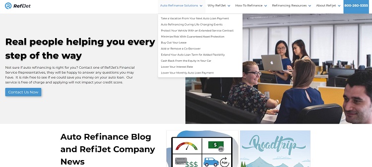
RefiJet uses relatable terms to cause users to seek more information, such as “Why RefiJet,” “How to Refinance” and “Auto Refinance Solutions.” A downward arrow indicates that if they hover over that option, they will see additional details.
It’s clear they’ve thought through their hierarchy and how best to reach their target audience. You could base the categories and subcategories on questions potential customers already ask.
4. Remember Current Customers
It costs more to acquire a new customer than keep one you already have. In the last few years, the costs of gaining new clients increased 50% or more. When planning your user-friendly navigation options, think about the areas of your site current customers visit most frequently.
How can you make it easy for your clients to log in and check a bill, get to only new content, or navigate to the sections they use most often?
5. Use Natural Language Patterns
Think about the language you use in your navigation. People tend to speak in a certain way. Is it more likely they would say they want to “contact” a company or “correspond?” The difference between options that say “Contact Us” and “Correspond With Us” is massive.
You must know your users and understand what makes them tick. If your site caters to linguistics scholars, you may want to use more advanced wording to speak to their grammar souls. On the other hand, if you mainly serve people who don’t care what the thesaurus says, you might want to choose straightforward phrases.
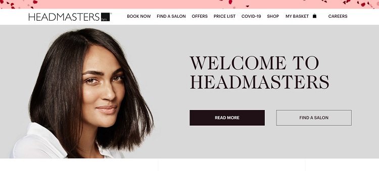
Headmasters uses language someone looking for cosmetology services might use. Words such as “salon,” “price,” and “book” will be familiar in this industry. Keeping things simple and using language their target audience is likely to use makes the navigation intuitive.
6. Consider Mobile
The global population is approximately 7.83 billion people, with 5.22 billion using mobile devices, or about 66.6% of the world owning smartphones. More and more people use their phones to access the internet.
The navigation structure that works for your desktop users won’t necessarily work for your mobile users. Not only do traditional tabs take up much of the screen, but they also may not convert well and leave text size so small as to be unreadable.
Test everything on an actual phone and see what the usability is like. Would a hamburger menu work better for your smartphone users? Do animations cause the screen to freeze? Fix any issues and make sure everything is responsive to smaller screen sizes.
Put the Customer First
The best way to ensure you have a user-friendly navigation hierarchy on your website is to look at the design through the customer’s eyes. Is there anything they don’t click on that can be removed? Perhaps they search for a term frequently, but it isn’t in your navbar. Look for ways to make your navigation simpler and better for the user, and you’ll have excellent UX.
About the author:

Eleanor Hecks is editor-in-chief at Designerly Magazine. She was the creative director at a digital marketing agency before becoming a full-time freelance designer. Eleanor lives in Philadelphia with her husband and pup, Bear.
 Return to Previous Page