Show:
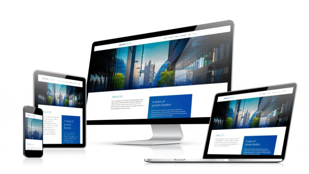
Migrating Your Website To One With Responsive Design
April 15, 2022
 Web development
One of the most effective ways of staying ahead of the competition in this digital age is having an online presence. This means leveraging the internet’s vast opportunities, including social media, eCommerce, and owning a website, among many others. All of these tools have their peculiarities and features.
Floating a website for your business, for example, is key to carving out a niche for yourself in the ever thriving digital market. It’s an easy and effective way to reach your target audience and interact with them quickly. However, if this is not done correctly, you might create more problems for yourself.

A typical example has a non-responsive website design. Basically, this design works smoothly on all devices. If your website is non-responsive, your users run into different compatibility problems.
We will consider migrating your website from whatever it is now to a responsive design to avoid that.
More so, we will talk about the costs of these changes and remember that there are options such as a microloan that will provide you with the necessary money in case you do not have it.
What is Responsive Website Design?
As we said earlier, a responsive website design aims to create web pages that look good on all devices and respond optimally to the environment in which it is viewed. There are so many factors to make your web pages responsive on all devices. All of which we will talk about while we discuss how to migrate your website.
However, if you are not tech-savvy, some of the technical terms here might sound new and a little complex, but not to worry, we will make it basic for you to understand.
The Layout
Usually, the first thing you want to do to make an existing website responsive is to adjust the layout. In fact, it is the first thing you want to look for if you are building a responsive website from scratch. You have to add media queries and maybe some changes to your CSS, and boom! You have a responsive site. Okay, that’s not all!
Usually, creating responsive web pages is done one step after the other. Adjusting the layout of your website helps to eliminate default functionality and allows users to zoom into the layout by pinching.
And when you add some media queries, it checks for compatibility with media features, and more importantly, it allows all displays to come out well and perfect on all devices, from smartphones to big screens.
These steps tell you what can be done to make your website responsive. To do that, there are couples of coding that must be done to achieve. Hence, you will need the services of a professional developer, if you are not one, to help you migrate. Professionals don’t come cheap, and if you are running low on budget, you may want to consider taking microloans.
Medias
The next step is ensuring your media, such as video and images, don’t get bigger than their parent container. There are different ways to approach this, and it depends on what your professional prefers. There is the data-* attribute and powerful CSS3. While the former may store replacement image URLs, the latter can replace default images with an optimized version.
A common trend among site owners is incorporating videos from third parties, Youtube or Vimeo, etc., into their website. There are techniques to do this and ensure they are responsive on all devices.
Typography
Finally, on migrating to responsive website, the last step is usually neglected by developers when building a responsive design website; Typography. Precisely, what we will talk about are the fonts. Most developers prefer pixels to define pixels, but not only is pixel non-responsive, but it also lacks some appealing features.
The fonts should be in sync with the parent container width for easy adaptation to different screens for a responsive website design. It also makes readability on mobiles easy.
There are three steps to help you migrate your website with a responsive design. As you must already know, anything involving tech upgrades or developers and programmers’ services than a penny. Hence, if you are running on a tight budget, do well to make microloans to keep you in business.
 Return to Previous Page