Show:
How Strategic Use of Color in Web Design Can Increase Conversions
October 26, 2022
 Marketing
Here’s something that’s all around us but that we take for granted – colors. Colors fill our world; they give it its vibrance and zest.
Without color, our lives would be that much drabber; even the gray skies of autumn and heavy rains contrast with the brightly-colored leaves of trees shedding those leaves.
Indeed, colors are all around us, and they have a very profound influence on us through our emotions. For eons, humans have painted their houses, tombs, and even faces to make themselves, or whatever they’re painting, pretty, or to intimidate.
Thus, colors have become an inexorable part of the human world, a way for us to express emotions at a glance, and warn or direct one another with a very simple tool.
It is no wonder, then, that color has also seeped into web design as a tool for evoking emotions. As we’ve said, colors have always been a part of our lives and have been utilized by marketers and web designers everywhere to prompt us to take action.
But how do you actually do it? How do you actually use color to “convert” a visitor into a customer? Well, you’ll have to stick around if you want to find that out!
The Essential Effect of Colors on Conversions
Colors have been used since times immemorial to prompt action. Even now, signs are colored the way they are to give you a signal at a moment’s notice and to grab your attention.
Thus, red signs often indicate danger or force people to stop, orange signs signify caution, and green usually says go. And this isn’t only on traffic lights – various machinery uses the same color coding to signify these exact things.
It is, then, no wonder that many colors have been used in various designs, from marketing to web design, to inspire people to action. After all, almost all of these designs come with a very firm backing in research and resources. People have spent years studying colors and their impact on our psyche, and they continue to do so today.
You might have seen some scenes in movies or TV shows where a company would perform a test by playing their next big ad to an audience of assorted average people. These events also take place in real life, and they actually show the companies testing and gathering data for the ad, as well as adjusting their marketing strategy as a whole.
And, if these carefully crafted colorful ads can lead to people buying products, you can do the same with your website – you can make a conscious effort to pick just the right colors to move people to convert from simple visitors to actual customers/subscribers.

Colors and Their Meanings
Now that we know what makes colors so important in conversions, let’s take a look at some of the most prominent colors, what they mean, and what emotions they are supposed to invoke.
Red
Red is one of the most easily spotted, widely used and recognizable colors. It is also a primary color – no two other colors can be used to make the color red.
Red is the color of passion. It is the color of love and sex; it is the color of romance.
It is also the color of danger, anger, blood and murder.
Either way, the color red can evoke some very powerful emotions that can stick with us for a long time. And this is exactly what web designers and webmasters are banking on.
You see, one of the best strategies to make people engage with you is to become memorable. And to become memorable to a person, you also have to evoke a very powerful feeling, as our strongest memories are often tied to exceptionally powerful emotions.
The color red is often used in ads that are supposed to inspire urgency. Ads for discounts, sales, giveaways – they all feature the color red in one form, or another, to signify that the event they’re advertising is limited in time only and that one should hurry to take part or miss the chance.
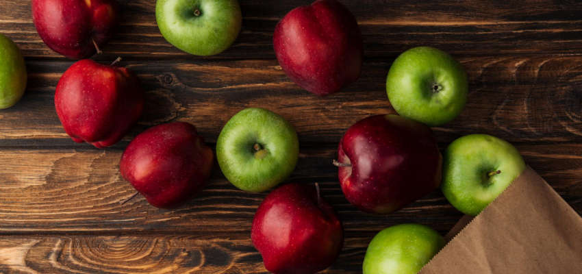
Green
Green is the color of nature and peace. It is also, according to studies, the easiest color for our brains to process, and, as such, has often been associated with peace and tranquility.
However, as we said earlier, brighter shades of green can be indicative of action. Green has often been used on machines to indicate their ready state and on traffic lights as the go light.
Essentially, green can be used to either evoke nature or evoke readiness and action. Darker shades of green are often associated with nature, with plants, fertility and life in general, so it is often employed by environmentalist groups or businesses that have very close ties to nature.
Yellow
Yellow is the color of sunshine and gold.
Yellow is the color of joy, happiness, giddiness, and overall excitement. This is also why many advertisements targeting children often have yellow in them to draw the kids’ attention and make them feel a happiness that is tied to whatever the ad is showing.
Yellow is also the color of opulence. As we said, gold is yellow, and darker shades of the color can indicate massive wealth and/or class, and other things associated with that noble metal.
Finally, yellow is also the color of speed. This is why electricity is often depicted as yellow, as well as lightning, indicating great speeds.
One final note, however – be careful when using yellow too much. The color’s exciting and happy nature can be very oppressive at times, so be sure to use it sparingly, and test it thoroughly in your wireframe.
What is a wireframe, you ask? Click on the link and find out more about it!
Blue
Blue is the color of calmness, stability, honesty and, in darker shades, sadness. Blue is often used by financial groups because of the implications we stated above.
This is because people working in finance tend to see themselves as very calm, collected and rational. Finance is a very serious business, and you cannot survive in that world without knowing how to keep your cool.
However, blue can also be used with groups associated with nature and all things natural. After all, blue is the color of the oceans and oceanic life, and brands that either deal with the ocean and its critters or simply want to show that they’re as calm as the oceans themselves will use blue in their designs.
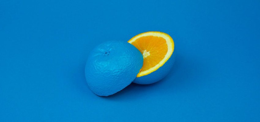
Orange
Orange is the halfway point between red and yellow. As such, it inherits the traits of both colors, albeit with a much-lessened intensity.
You may have noticed this: orange is often used by websites for their CTA buttons. This is because of orange’s native ability to inspire people to action, but a sort of well-thought-through action, rather than speedy action like yellow, or passionate action like red.
You’ve also noticed many instances where orange is used as a color of caution, and web design and marketing are no different. Discounts that are a little bit longer lasting will usually be displayed in orange to make themselves known and indicate that the clock on their affordability is ticking and that the customer should act.
Black
Usually, the color of death, doom, darkness and loss is also called one of the most beautiful colors.
Why? Because black is inexorably tied to elegance and beauty of the highest standards. It is not too hard to imagine a femme fatale in a black dress or a black limousine taking you to an expensive dinner. Thus, black has become a sign of elegance, style, opulence and wealth.
Black is also very popular, or is, at least considered quite popular, hence the saying that something is “the new black,” meaning that something has become incredibly well-known and sought after.
White
White is the color of cleanliness, purity, innocence and the divine.
As such, hospitals, as well as many organizations associated directly or indirectly with the medical industry, choose white in many of their designs. White symbolizes pristine cleanliness as well as mercy, something that has long been associated with medical workers.
Conclusion
Ultimately, we hope we’ve proven, without a reasonable doubt, that color is essential for business and, by extension, an essential part of design meant to aid in conversions.
Now, it isn’t to say all the colors will work for your website just as well – it is up to you to test out various designs and find the one that fits your website perfectly, eliciting your audience’s desired responses.
About the author:
Travis Dillard is a business consultant and an organizational psychologist based in Arlington, Texas. Passionate about marketing, social networks, and business in general. In his spare time, he writes a lot about new business strategies and digital marketing for DigitalStrategyOne.
 Return to Previous Page