Show:
Tips for Designing Spline Charts To Communicate Insightful Data Analysis
October 13, 2023
 Business
Data analysis is a crucial aspect of several industries, from finance to environmental science and more. It’s necessary to present this data in a way that’s easy to understand and interpret. One such method is using spline charts. In this article, we will explore what a spline chart is, its importance in data analysis, and real-world applications. Keep reading to learn more.
Understanding the Basics of Spline Charts
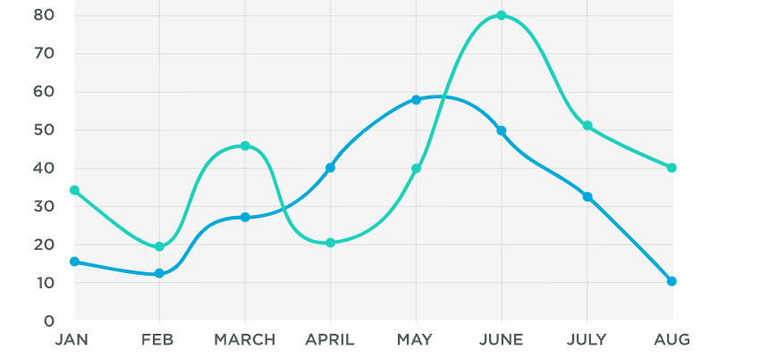
A spline chart, a type of data visualization tool, represents information as a series of data points connected by curved lines. This technique is helpful in smoothing out fluctuating data and revealing overall trends and patterns.
Compared to straight-line graphs, which can only show linear relationships, a spline chart offers a more nuanced picture. This allows for better representation of complex datasets that have multiple variables or non-linear relationships.
To create a spline chart, you need a dataset, preferable time-series data, and a suitable analytics platform. Depending on the software, you can customize your chart in various ways, such as altering the curve’s smoothness or the marker points’ size.
To interpret a spline chart effectively, focus on the trend lines’ direction and peak values. Look out for increases, decreases, and patterns over time. These insights can help predict future trends or identify areas of concern.
The Importance of Spline Charts in Data Analysis
Spline charts find utility in many fields that rely heavily on data analysis for informed decision-making. Spline charts play a critical role in data visualization and trend identification in data analysis. With a well-designed spline chart, complex datasets can be simplified into understandable graphics.
The use of curved lines in spline charts makes it easier to identify trends, as the curves provide a smoother, more accurate representation of data points over time. This is particularly useful when dealing with volatile data, such as stock prices or weather patterns.
Additionally, spline charts can be tailored to highlight specific data series, making it easier to compare and contrast different datasets. This versatility makes spline charts an invaluable tool for researchers and analysts across a wide range of sectors.
Moreover, displaying data in a visual format helps with better comprehension and retention of information. A well-designed spline chart can communicate complex data insights in a manner that’s easily understood by both technical and non-technical audiences.
How to Optimize Spline Charts for Clear Data Communication

In order to communicate data clearly through spline charts, it’s important that the visual aspects of the chart complement the data it’s representing. The use of a cohesive color scheme, clear typography, and a balanced layout can greatly enhance readability.
An interactive element, such as a tooltip that provides more detail about a certain data point when hovered over, can add depth to the chart and make it more engaging. Tools like sliders or filters that allow users to explore the dataset on their own can also enhance the interactive experience.
On the technical side, opting for high-resolution charts will prevent any loss of detail when the chart is viewed on different screens or printed out. Ensuring that the chart remains responsive across various devices is also crucial.
Lastly, be careful not to over-complicate the chart with unnecessary design elements or information. Simplicity enhances clarity, and ultimately, the primary goal of a spline chart is to communicate data effectively.
Real-World Examples and Insights from Effective Spline Charts
Successful applications of spline charts can be seen in numerous sectors. In finance, for example, they can be used to track the performance of stocks over time, highlighting peaks and troughs.
Environmental scientists may utilize spline charts to monitor changes in temperature patterns or animal populations, providing an intuitive visual aid that simplifies complex data and helps identify trends. In the healthcare sector, spline charts can visualize patients’ vital signs or the spread of disease over time. It enables medical practitioners to glance at a patient’s entire medical history and understand the progress of a patient’s condition.
Overall, these real-world examples demonstrate the utility and versatility of spline charts in conveying complex data-driven insights in a digestible manner.
Altogether, spline charts play a pivotal role in data visualization and analysis. Understanding how to design and interpret these charts effectively can significantly enhance your ability to communicate complex data in a clear and concise manner.
 Return to Previous Page