Show:
Designing With Data: Visualizing Information With Infographics
April 13, 2023
 Marketing
There is a massive demand for data in the business world, pushing companies how to analyze the data and share it with other people. There are common visualizations methods that people have used for years, i.e., pie charts and bar charts.
Companies have moved from that, and some are currently using infographics.
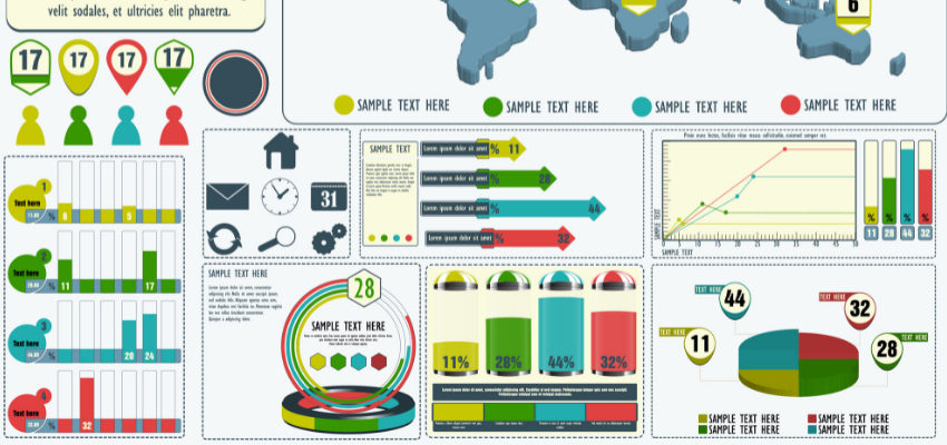
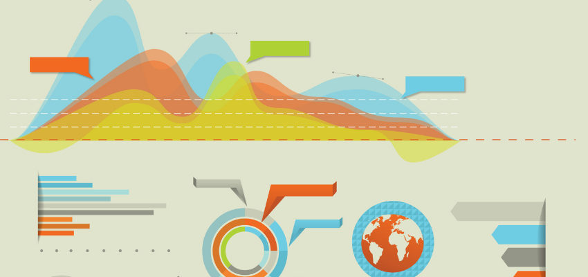
Infographics use content and visuals for data representation during data analysis. It displays information with visuals accompanied by content, such as comments, short descriptions, or labels. They represent a large piece of information once. They play an essential role in forecasting and easier decision-making.
Types Of Infographics For Visualizing Information
There are several types of infographics, depending on what they do. Some of the common ones are as follows:
- Informational: You use it to divide ideas into sections, each with headers to organize data visually.
- Statistical: It is mainly when dealing with numerical data. It may incorporate some data visualization techniques like bar charts and pie charts.
- Timeline: It uses pictures and dates to show events of specific projects and how there will be changes over time. It is suitable for displaying a series of events.
- Process: It involves dealing with different processes or steps. You use data visualization to create flow charts, i.e., when outlining to your customers how to book a room in your hotel.
- List: It involves listing items accompanied by icons or numbers. It is best when sharing tips or resources.
- Geographic: It deals with sharing location information like weather, amenities, population, gender, etc. The infographic can use different features like maps, labels, and icons.
- Comparison: When you would like to compare different items. When displaying their data, you can use different items and columns and compare all the products or services.
- Hierarchical: As the name suggests, we use it when we want to represent information by ranking it from the highest to the lowest. The infographic may make use of flow charts or even pyramid charts.

How To Design Infographics With Data in Mind?
You may be wondering what steps one must follow when designing infographics. There is much to consider, especially if it’s your first time creating such a design. The following are steps you can follow when creating an infographic:
- Create your purpose. In this step, you must understand your purpose or job for creating an infographic. It can be for a blog post, social media, data analysis, reports, etc. Understand your intended audience and craft an outline.
- Revisit your data and check the best data visualization to work with. Analyze the type of data you will work with and determine which options to choose. You can select a bar chart, flow chart, pie chart, or pictograph.
- Create a layout of your infographic. Examples include using maps and Procreate grain texture brushes for changing patterns and textures.
- Ensure the data you use is very clear, captivating the audience, and very accurate. If you find something unclear that may confuse your audience, rectify it and find another alternative.
- Finalizing your infographic design by ensuring everything gets done perfectly. Look at the icons, colors, text, and data source to ensure you have done them correctly. If there are changes, act on them before having a final copy of the visualization.
Why Use Infographics For Visualizing Information?
Some of the common reasons for visualizing data using infographics include the following:
- It provides a summary of the whole topic.
- It provides a clear comparison of the two entities.
- It provides better research findings after a case study.
- It breaks a complex process into simpler terms.
Where To Use Infographics When Visualizing Information?
You can use Infographics on any type of information provided you have the idea, subject, and concept. They are suitable for displaying trends, products, different situations, and services. Some of the common applications of using infographics to display information include the following:
Marketing Information
When creating content for your audience, using infographics is good. They create more attention by engaging more users with your products and services. Ensure the description is short and clear.
Businesses can use them to share their achievements, improve their interest in your products, showcase their products and services, summarize different business points to the customers, and make roundup infographics for blog posts.

Small Businesses
Many businesses have shifted more attention to their online audience. Companies have active social media channels on Facebook, Instagram, LinkedIn, TikTok, etc. They create posts daily to keep their audience informed.
Using infographics in your content produces higher results as your audience is familiar with the current data, trends, and information as shared on the visualization. It increases brand awareness by showing business services, goals, offerings, history, etc.
Schools
Education trainers and providers use infographics to share different content with their students and parents. It makes it easier to remember, especially for the kids.
Consultancy
Many consultants and freelancers sometimes work on projects that will take more time. They split the project into different sections. They can visualize the projects using infographics by visualizing the timelines to reduce arguments during proposal discussions and showing progress reports faster.
Government
Government bodies and ministries handle a lot of data. They use infographics to represent visuals of their data, i.e., census data, healthcare data like vaccination numbers, education access, etc.
Blogs
When creating content for your blog, you can improve engagement by creating articles with infographics. It makes the content more appealing to the readers, according to the data.
NGO’s
Non-profit organizations can use them to share specific metrics they have. For example, they can share the total funding raised, the number of donors, their successes, campaign strategies, annual reports, etc.
Case Studies
It involves doing research on a particular topic and later bringing out results. It plays an essential role in decision-making by analyzing the results, statistics, and findings.
Conclusion
Knowing how to use infographics when visualizing data is one of the skills every business should put into practice. It will enable you to communicate effectively with your audience by increasing engagement and making the decision easier. It eventually increases sales and the number of users if you have a product or service.
About the author:
Vibhu Dhariwal is Co-Founder & Director of Marketing at Digital Gratified, a SaaS Digital Marketing Agency. He likes sharing his experience in outreach marketing, link building, content marketing, and SEO with readers.
 Return to Previous Page