Show:
Email Pop-Up Types And How They Drive Sales
In 2022, more than anything else, the cornerstones of all successful email marketing campaigns are nothing other than email pop-ups. With email pop-ups, email marketing can reach a more pertinent audience at a lower cost, making the whole process much more efficient and cost-friendly for companies of all sizes.

In fact, the whole point of having email pop-ups in the first place is to create and enlarge your company’s mailing list and launch successful marketing initiatives for the people who opt to subscribe to your mailing service, thanks to your email pop-ups. However, in order to collect these priceless emails, you must first develop the best email pop-ups and entice your prospects to engage with them and eventually become your paying customers.
In fact, along with the content presented in them, your pop-up design is the sole thing that can make the difference between people leaving the page quickly or taking the time to enter their email information and become customers. For that reason, you must carefully evaluate many design components and considerations when creating your pop-ups to effectively add subscribers to your list and drive more sales along the way.
Whether you are just beginning your email pop up marketing adventure or want to acquire some fresh new design ideas, we’ve got you covered. Here are the most common email pop-up types that you can utilize in your line of work to get more clients and drive more sales!
The Standard Email Pop-Ups
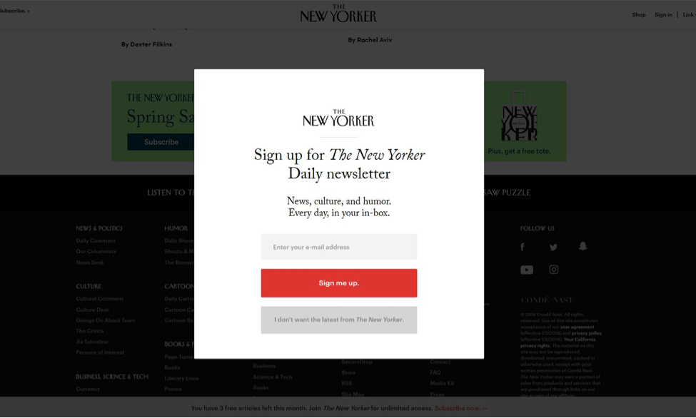
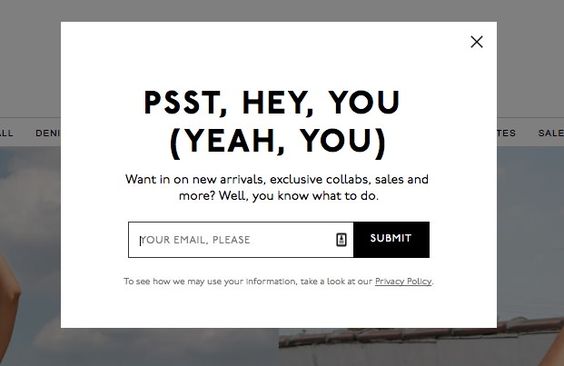
The email popup that is considered the industry standard may typically be seen on a variety of different websites. A little window like this one should show up at the very top of the information on the web page.
By showing and promoting pertinent offers such as free shipping, gift, discount, and so on, the standard email pop-ups are utilized to collect email addresses for further processing. These are frequently shown by tracking the digital footprints left by visitors to provide those visitors with more personalized offers.

Side Messages Email Pop-Ups
Side messages will frequently display on either the left or the right side of the screen in a manner that does not completely hide the content of the web page. These are wonderful for delivering on-site messages without interfering with the user experience and are highly recommended. Therefore, side messages are great for this purpose, particularly if you want to collect email addresses without disrupting the experience of your site’s visitors.
Full-Screen Pop-Ups
Pop-up windows that take up the whole screen are known as fullscreen pop-ups, and marketers often avoid using them, because these pop-ups can make the website visitors feel overwhelmed by the aggressive approach the website takes to collect their information or to present them with some information.
However, if there’s something incredibly important that you want to share with your visitors, full-screen pop-ups are the best to successfully attract the full attention of the site visitors. These popups resemble landing pages in all essential respects.
Pop-Ups Activated By Scrolling
When a visitor scrolls down to a specified point on your page, a pop-up window called a scroll-triggered pop-up can appear. Because they won’t display until after the reader has read the majority of your information, they are almost exclusively utilized in blog articles.
In other instances, a scroll-triggered pop-up window may appear when a visitor has scrolled through around 70% of your website. People who have scrolled down to see your pop-up have already experienced some of the benefits you offer, so they are more likely to engage with it when it appears.
Sticky (Nano) Bars
These announcements will frequently appear in the form of pop-up bars that will either adhere to the top or bottom of the user’s screens. In a manner comparable to that of the side messages, these are built in such a way as to not interfere with the visitor’s ability to navigate the website in any way. They are ideal for when you need to communicate with visitors across your entire website but don’t want to annoy them or force them to engage with your overlay in any way.
Time-Based Pop-Ups
Pop-ups that are time-based appear at predetermined intervals throughout the day. Pop-up windows, for instance, can appear on a website sixty seconds after a visitor has arrived there. This type of pop-up is by far the most common, and it may be customized to appear only on a particular landing page or anywhere else on your website.

Exit-Intent Pop-Ups
Only when a visitor is thinking about leaving your website for good, a pop-up known as an exit-intent pop-up can emerge on the screen for the sole reason of trying to prevent the user from leaving your page.
The fact that a visitor’s mouse cursor has reached the top of the page, which is an indication that they are about to leave, is detected by them so that they can take appropriate action. The pop-up window that shows when a user is about to leave your site can remind them of the offer you have and may even help minimize the number of abandoned shopping carts.
Final Thoughts
When implemented correctly, pop-ups have the potential to provide a major boost to the growth of both your email list and your company. Pop-up nirvana is reached when a website’s users receive value from the advertisements that appear on their screens without having their browsing experience negatively affected. It is the desired outcome in all email pop-up efforts and the use case that marketers genuinely chase.
Now that you know the different types of email pop-ups and how they can help your company drive more sales, set aside a budget for them and start incorporating them into your marketing operations as soon as possible.

 Return to Previous Page


