Show:
How to Collect Quality Emails Without Damaging the User Experience
April 16, 2025
 Marketing
Most users don’t mind sharing their email if there’s a good reason and the timing feels right. Push too hard, and they bounce. Play it too safe, and they slip away unnoticed. The real challenge? Collecting emails without breaking the flow of a smooth, respectful user experience. This post is about finding that balance—no dark patterns, no annoying popups—just smart, user-friendly ways to grow a high-quality list that actually wants to hear from you.

Why User Experience Matters in Email Collection
Users don’t hate email forms. They hate feeling tricked into them. An aggressive popup two seconds after landing or a full-screen overlay with no exit button doesn’t build trust. It breaks it. According to Baymard Institute, 70% of users abandon sites due to poor usability. And today’s users are quicker to judge as ad fatigue is real, and patience is short.
If your form interrupts rather than fits the flow, it’s not just annoying—it’s expensive. Damaging UX doesn’t just cost emails, it costs conversions, credibility, and returning visitors. Respect their time, and they’ll be far more willing to hear from you.
To make email collection forms effective, choose a reliable service for their creation. Pay attention to ease of use, the availability of templates, and the flexibility of popup display settings. For example, Claspo’s popup builder features a drag-and-drop editor, making it easy to create popups with the desired design by simply connecting pre-made blocks and customizing them.
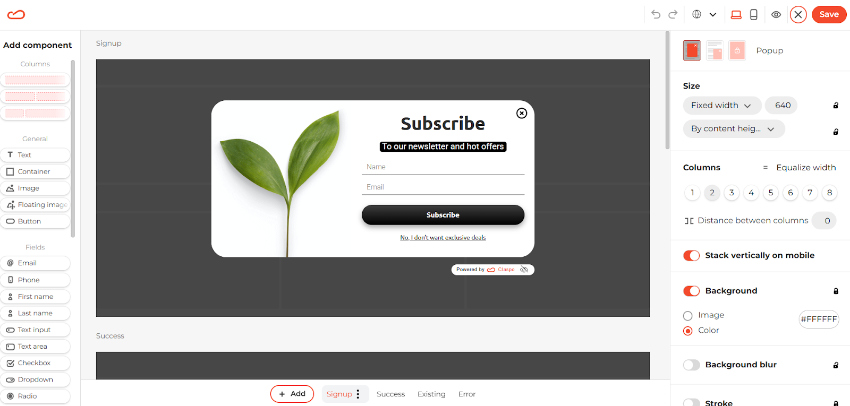
Claspo’s drag-and-drop editor
Additionally, there’s a library of ready-to-use popups. Claspo templates are ready to be used and are also customizable.
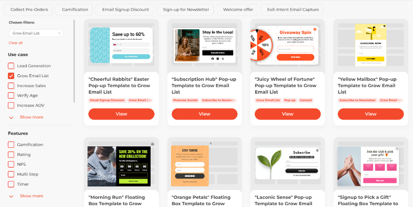
Claspo’s template library
Exit intent, geolocation, and other targeting options are available in the popup display settings. These and other tools will help you create a subscription form that collects user emails without irritating them.
Smart, UX-Friendly Ways to Collect Emails
You don’t need to sacrifice user experience to grow your list. Just rethink how and where you ask. Below are five proven ways to collect emails that feel helpful, not pushy. They don’t interrupt the journey; they support it.
Exit-Intent Popups
Popups aren’t the problem, it’s when they show up. Exit-intent triggers are less intrusive because they wait until the user is about to leave.
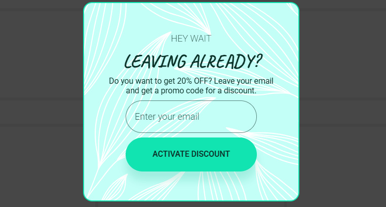
Exit-intent popup from Claspo’s template library
You’re not interrupting the experience, just catching a final moment of attention. Keep the copy short and the offer clear. No guilt trips, no fake urgency. Just a simple ask with a reason to say yes. Done right, this gives you a second chance without messing with the first impression.
Embedded Forms in High-Intent Areas
Not all forms need to pop. Some just need to be there when users are ready. Blog posts, pricing pages, and help docs are high-intent zones and perfect for subtle, inline forms. No need to wave your hands. If the content is helpful, people will notice the form. Make sure it blends with the design and feels like a natural part of the flow, not a sales trap disguised as a “subscribe” button.
Gamified Opt-Ins
Spin-to-win wheels and mini quizzes can work but only if they feel like part of the brand experience, not a casino ad.
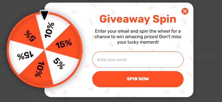
Gamified popup from Claspo’s template library
Gamification adds a layer of engagement, not magic. The key is relevance. If your audience isn’t likely to enjoy playful mechanics, skip it. But if it fits, it can turn passive visitors into active participants and nudge them into sharing that email without a second thought.
Progressive Profiling
You don’t need everything up front. Start with just an email. If the user engages, you can ask for more later—name, preferences, company size, etc. This approach lowers friction and shows respect for the user’s time. It also gives you cleaner data, because only truly interested users go through the full flow. Think of it as a conversation, not a form. One step at a time.
Lead Magnets That Actually Help
People know the difference between a useful resource and a recycled PDF. If you’re asking for an email, give something worth the trade like a real checklist, a quick tool, or a short course.
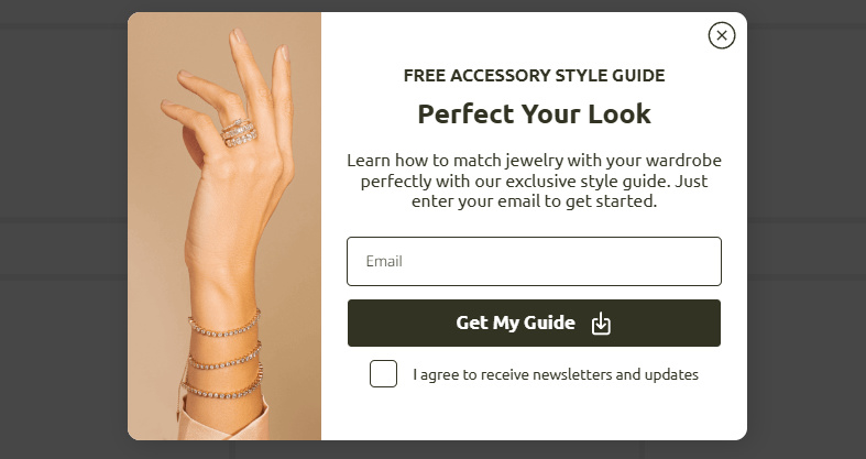
Popup with a lead magnet from Claspo’s template library
Align it with their goals, not your agenda. When the value is obvious, the form becomes a formality.
Best Practices for Minimizing UX Disruption
- Make opt-ins skippable and dismissible: If a user can’t easily close your form, you’ve already lost.
- Design consistency: Ensure the form feels native to your site, not like an ad slapped on top.
- Clear value proposition: Say what users are getting and why it’s worth it, without overpromising.
- Mobile responsiveness: Avoid clunky forms and tiny “X” buttons—frustration leads to abandonment.
- Respect user space: Good UX doesn’t beg for attention—it invites, then gets out of the way.
How to Measure Success Without Guessing
If you’re not testing, you’re guessing. A/B test your subscription forms, copy, and timing.
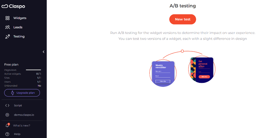
A/B testing functionality in the Claspo popup builder
Track what matters: click-throughs, bounce rate, time on site—not just how many emails you collect. Use heatmaps to see where users lose interest, and keep an eye on unsubscribe and spam complaint rates. A high signup rate means nothing if half your list tunes out or leaves. Real success is what happens after the email is collected.
 Return to Previous Page