Show:
How to Put Visual of Your Website in Focus
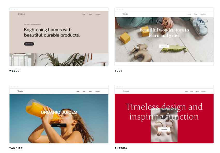
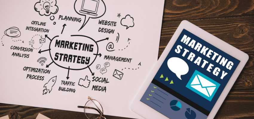
Your website’s visual content plays a vital role in keeping your audience engaged, and persuading them through the buying process. Interesting visuals are considered a smart marketing strategy. Your website may use videos, images, infographics, memes, screenshots, and presentations for marketing campaigns. According to PR Daily, the success rate of using well-designed visuals being viewed is way too high compared to a content without any visuals. Majority of the customers that were asked why they didn’t like the website responded that the site’s design was not too appealing and enticing. Marketers noticed the significant impact of this strategy on growing their business.

The Content Marketing Institute and MarketingProfs made a study in 2018 and came up with the conclusion that B2C marketers selected pre-produced photos, videos, and illustrations as the most effective marketing types in achieving their company’s specific objectives. It can also resonate with the audience through visual storytelling and permeates different emotions – joy, sadness, anger, fear, or shock.
There are no specific set of principles in creating an excellent visual design. However, there are basic components to explain your concept better than words.
Images and Infographics
Customers are more inclined to finish the written content if there are compelling images between the body of the text. Make sure though that these images are of excellent quality and contextually relevant. According to Jeff Bullas, a famous marketer, contents with pictures get 94% more views than those without. Avoid using the same dull photos from the same places. Explore other better stock photo sites like Pixabay or Unsplash. But original pictures are even preferable and captivating for an enviable personal touch.
If your site focuses on selling products, the photos should represent the products in the best possible light. The customers’ impressions and buying decisions may depend on how you introduce the product based on the images you use.
Infographics, on the other hand, make complex content easier to understand. By definition, an infographic is a collection of charts, images, and simple text that gives an easy-to-comprehend overview of the topic. It is a highly important tool in visual communication. Studies revealed that about 90% of the information transmitted to the human brain is visual. Entrepreneurs acknowledged that digital displays are a valuable element in building brand awareness. Every business realized that the exceptional brightness that illuminates from the LED display is crucial in increasing the product’s selling opportunities by capturing the people’s attention. Even government and non-profit agencies use infographics to raise awareness, promote events, show statistics, and census data. However, if there are several concepts and messages, it can be challenging to organize the information in an infographic. The combination of text, images, and data should be both informative and engaging.

Design and Color
The right color combination allows you to have a solid foundation for your website design. It is essential in creating a successful web page. The first layer of communication occurs when something looks interesting. Before the conscious mind processes pieces of information, the subconscious has already evaluated if something is motivating or not.
Color choice is important as it sets the mood and stirs the emotions of the person. Colors also aid our brains to process and store information more efficiently than plain black and white images. Customers recognize brands easily. The color palette you choose for your website should result in a better response. Also consider other factors like branding, the trend, your audience, emotional response, and creating balance and harmony. However, understanding color theory is also helpful.
Design is critical as it impacts the customer’s perception of the brand. The impression can either convince them to stay on the page and learn more about the product or quit reading and move to a competitor’s page. An excellent design can also build trust with the audience and creates consistency. No customer would trust an outdated and poorly designed website. Similarly, if the layouts, fonts, and styles of your website are different on every page, it will look shady unprofessional. The old and low-quality of your site can be the primary reason for competitors to outrank you.
Website Usability
Usability pertains to the efficiency of the website when it comes to customer service and interaction. Some websites have fascinating designs difficult to navigate, confusing buttons, hyperlinks and menus, irrelevant contents, images, and videos. According to Ted Waitt, CEO and Founder of Gateway Inc, “People want less information, they don’t want more information. They want it to be easier for them to use. Easier for them to get what they want. Easier for them to do what they want to do. The next big breakthrough is going to come from the usability standpoint.”
Key areas to consider for great usability include:
- Communicate with clear objective, lucidity, and inviting tone
- Clear, simple, and organized menu
- A “help desk”, “LiveChat”, or “Contact us” should be visible
- Concise information for better understanding
- Do not overload the page with information
- Emphasize on what’s important on each page
- Keep the content unique and buttons should be prominent
User experience and website usability are closely related. Often, inferior usability may lead to poor user experience.

Consistency
Consistency is about creating uniformity in all elements, having them appear and behave in the same manner. For instance, if you use a light color background on all your quotes, then it has to be consistent everywhere. The fonts, size, and color of the headings should be consistent and uniform as well. Once you have established a language for how to interpret the product’s elements (be it photos, videos, text, quotes, etc.), use the same layout consistently. By doing so, you create trust and give the impression that you are organized.
The visual element of the website is critical in promoting the product. It’s more effective to convey messages and craft topics through visual content. A strong website improves the user interface and generates greater user traffic which eventually leads to increased conversions. A well-built visual element also increases brand awareness as customers retain information better through videos and images than with written statements. Finally, while this component is more interesting, focus on your goal to improve traffic and increase leads.

 Return to Previous Page


