Show:
5 Surefire Ways to Improve Your Homepage and Boost Conversions
Your homepage is one of the most important pages on your website. Think of it as a storefront. Close your eyes. Picture a wedding dress shop. Look through its windows. If you see Halloween costumes all over the place, would you walk in? Not exactly on brand, is it?

A homepage is created to reel in your customers. It’s a glass storefront, and the wedding dresses are in the sight of all viewers. Whatever you do on your homepage is what ensures that your customers will take a step into the rest of your website, take the required action or never glance at your site again.
How to improve your homepage
By taking the following steps, you can ensure that your website’s homepage is optimized for conversion.
1. Research your target audience
It is important to understand who your target audience is when creating your homepage. Are they young people who would prefer informal or semi-formal speak? Is there a particular kind of design and navigation they are used to? Are they older people who would likely need to see words in bigger fonts?
When you research your target audience, you understand their nuances. You figure out what they like, what works for them, and what does not. This way, you can ensure that your website’s homepage reflects their mindsets and meets their needs.
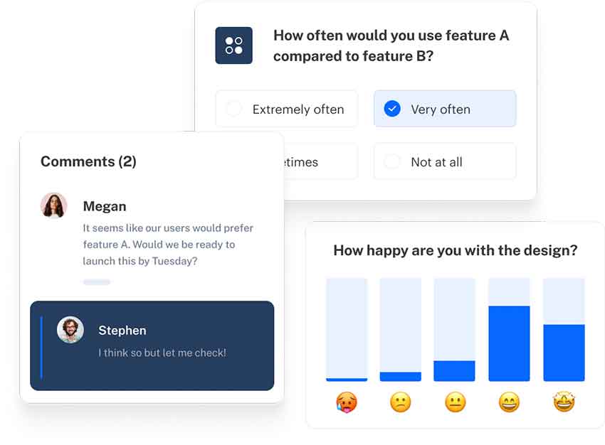
One great way to conduct research is to test. You can create a survey that helps you test the efficiency of your homepage. If you have a current homepage design and you would like to switch to something else, you can carry out a survey to compare which homepage design, content, and layout is more appealing. You can also find out which one would convert better.

The respondents in your survey have to be part of your target audience to accurately reflect the mindset of the end-users.
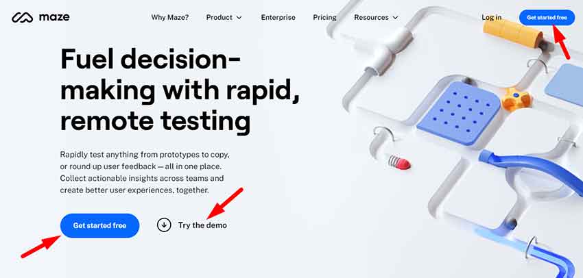
Several tools can help you achieve this. A concept testing survey is one of such. You can start concept testing as early as the ideation stage. Conducting this will help you get valuable insights into the needs of your audience.
It will also help you understand your audience’s usage patterns and prioritize certain updates over others.
While most things in life are a gamble, you can hedge against your homepage improvement being a total failure if you take these steps.
2. Include a Call to Action
Several elements could make or mar the conversion rate on your website. Is your audience bouncing off your homepage at a high rate without taking the necessary action? You might want to take a look at your Call to Action.
What is the key action you would like your homepage visitors to take when they visit your website? Do your visitors know what they are meant to do when they click on your homepage? If you do not have a clear Call to Action, you will very likely have visitors bouncing off your page as fast as they came.
CTAs are the tipping point between a bounce and a conversion. It is important to know what the necessary action is and let that be your sole CTA. You don’t want to confuse your visitors by including multiple CTAs that ask your audience to do several different things.
If you want them to sign up for an email list, that should be your sole CTA. Your CTA should also be prominent. It shouldn’t just be a link. It should be large, and it should stand out, so your visitors know immediately what next step to take after they look through your homepage.

The following are examples of common CTAs you can add to your homepage.
- Fill out a lead form
A lead form helps you get contact information from your visitors to enable you to follow up with them or remarket them at a later period.
- Sign up for an email list
Signing up for your email list helps the visitors maintain contact with you. They will get periodic content from you, and it allows you to market them.
- Sign up
If your website has a sort of membership, asking your visitors to sign up for a membership to get access to exclusive content.
3. Make it lively
People will stay on your homepage if it is interesting. Too many people cram a lot of information onto their homepage without thinking about how visitors will respond to it.
Everything on your homepage should grab the attention of your visitors and keep it. Creating a website filled with words might seem like a great idea at first, but it might just be counterproductive.
First, your headline should be captivating. If it’s boring, you risk people bouncing off from that very point. The headline is what makes the difference, so you should take care to ensure that it attracts the attention you want. As such, your headline should communicate the value you’re offering to the clients. It should tell visitors what they need to know and answer the question on their minds. When this happens, they are more likely to take the required action on your page.
Other interesting content can be included on your page, such as an explainer video. Video is one of the most engaging forms of content. When you add one to your homepage, you increase the audience’s chance of engaging with you. If the content is great, they are more likely to do what your CTA asks.
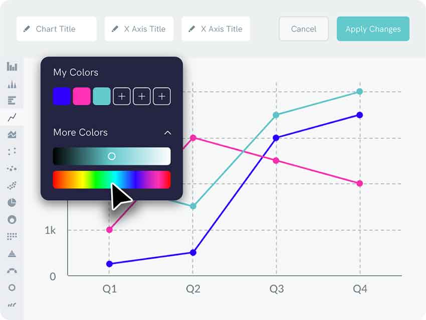
If you have a lot of data you need to present to your audience, you don’t need to represent them in a boring format. Instead, you can transform erstwhile boring data into a story that captivates your audience using tools such as this free line graph maker.

You want to create a tale that will grab your audience’s attention instead of presenting numbers that might be hard to understand at first glance.
4. Optimize for speed and responsiveness
When you’re done creating all your content, you just want to push to make it live. However, it is important to ensure that your website is optimized for speed and responsiveness.
Have you ever visited a website using your phone and realized that you could not do anything right until you switched to desktop mode? You probably clicked a button and it didn’t work or you couldn’t even see some crucial information. This is what happens when a website is not mobile responsive.
A large number of people will be accessing your website through their mobile phones. If you do not ensure that your homepage looks great on their mobile phones, then the chances are that they will bounce off. When websites are not optimized for mobile, the experience is not the same. You might find that your CTA is not visible on your homepage or that users cannot see important information. Sometimes, you might even realize that your images are skewed, too little, or too large to make any sense.
As such, your homepage must look as good on a mobile phone as it looks on a desktop. You just ensure that no information is lost and that it is easy to navigate on the phone.

Another important thing is to ensure that your homepage does not load slowly. You worked so hard to create a website that would attract the attention of your audience. It would be such a shame for them not to see it because your homepage took too much time to load.
You should ensure that you test the speed of your website both on desktop and mobile mode. Make sure that it loads within a very short period to ensure that you reduce bounce rates.
5. Keep it short and simple
It is exciting to want to include a lot of information on your homepage. Of course, it’s your chance to show your visitors what you’re about, and you want to make the best use of it. However, you should keep your homepage as short as possible. Only include relevant information to give them an idea of who you are and the value you are offering.
If you try to cram too much information into your homepage, you will lose users and record a lower conversion rate. Explaining every minor detail is not what converts your visitors.
Some websites have nothing but the headline and the Call to Action, and they still convert. One of the reasons for this is that first-time users do not want to be overwhelmed with content. That’s what the inner pages of your website are for. They can learn much more about you on those pages.
If you’re not certain about shortening the content on your homepage, you can conduct A/B testing. See what your users like. Compare the bounce rate and conversion rate on both versions of your homepage, and you can take the right action after that.
Conclusion
Your homepage is one of the single most important assets on your website. You should ensure that you continue to improve it to increase conversions on your website. To do this, you need to conduct the appropriate research, keep your homepage short and sweet, optimize for speed and responsiveness, make it lively, and include a CTA.
About the author:
Lydia Iseh is a writer with years of experience in writing SEO content that provides value to the reader. As someone who believes in the power of SEO to transform businesses, she enjoys being part of the process that helps websites rank high on search engines. Currently working as a CMO at Assignyourwriter.com, trying to get the company back to the top again.

 Return to Previous Page


