Show:
10 Examples of Interactive Product Pages
The marketing industry has come a long way from 19th-century black-and-white ads in newspapers. Today, ads and product pages have come alive, as shoppers have a chance to interact with them.
From videos at product pages, across ever more popular 360° views to the use of virtual and augmented reality, here are some of the best examples of companies which can boast interactive product pages.

Product page videos
On their own, videos are not suitable for a product page. They are more compatible with the main page but a short video or an animation can be used to enrich a picture gallery.
The following 3 examples show how retailers across the globe have been able to incorporate short videos to supplement product images.
Bed Bath and Beyond
The popular American retail chain of domestic merchandise is a typical example of how videos are implemented in a product page. A single video is inserted at the end of a picture gallery beneath the main product image.
A triangle inside of a circle is a clear indicator to visitors that they can play a video that will present the product in an interactive way. Moreover, you will find videos in galleries only for more complex products, such as blenders and charcoal grills, while items like curtains won’t have a product video because there is no real need for them.
Target
Another world-famous brand from the United States is Target. Apart from a handy, pre-select zoom, website visitors can opt to play a short video from the strip on the left-hand side of the main product image.
Even product you wouldn’t normally consider interactive have come alive on Target’s product pages, such as a children’s desk lamp. The animation for this particular product is short (it lasts only 5 seconds) but it’s catchy and to the point.
Hoselink
When you google “garden accessories” in Australia, Hoselink pops right up. The company’s ambition is reflected in the fact that product pages feature explanatory videos supported by Vimeo.
Like on Target’s platform, the video can be selected from a strip on the left side of the product image, alongside a 360° view of the product. This way, even a retractable garden hose reel can be made fun for potential buyers, who are looking for a visual demonstration of the product they are interested in.
A 360° view of the product
Unless a product page video is a stop-and-go animation, shooting such a video can be costly. Luckily, there is a money-saving alternative in the form of a 360° view.
This visual technique involves countless images that allow shoppers to create a 3D model of the product in their head. Depending on the industry, here are a couple of companies who have thrived on 360° views in product pages.
Dacia
Ever since it teamed up with Renault in 1999, Dacia had been improving its car models. The Romanian car maker now offers the same type of virtual freedom in designing vehicles as its larger competitors.
Once the prospective customer choses an engine for his new Sandero, for instance, they are allowed to rotate the vehicle in all directions to see whether they like the selected color. Moreover, Dacia offers a 360° view of the car’s interior, helping the customer get a multidimensional feel of how their new ride will look like from all perspectives.

Bulgari
You can tell that the Italian luxury brand Bulgari takes pride in the watches and jewelry they make just by looking at how they have presented their products. Bellow a gallery featuring high-def, zoomable images, there is a 3D button that allows shoppers to look at a watch from every angle imaginable.
The option is easy to select and the 3D image is even easier to rotate using a computer mouse (there are brief instructions as soon as you click the 3D image). Of course, when shopping for a watch nothing beats trying a watch on but a 3D image helps shoppers determine which watches they wish to put on their hand in a store.
Apple
Unlike the previous two examples, Apple presents its products in a different three-dimensional way. Namely, when you open the product page for iPhone 12 there is no need to select a 3D view, as all you have to do is scroll down the page to discover the smartphone’s features and see it from various angles.
In this sense, the California-based tech giant is truly a leader in the market, as they have discovered a way to incorporate the 3D view inside the very essence a product page. In fact, a person wishing to find out more about the latest iPhone will see the phone from all the angles without ever realizing so!
Virtual and augmented reality
Finally, we reach the apex of interactive product page design that is ultimately aimed at allowing shoppers to buy products online without having to visit brick-and-mortar stores to confirm their choice.
From sunglasses to furniture, here are top four examples of how virtual and/or augmented reality can instantly convert leads into sales.
Ray-Ban
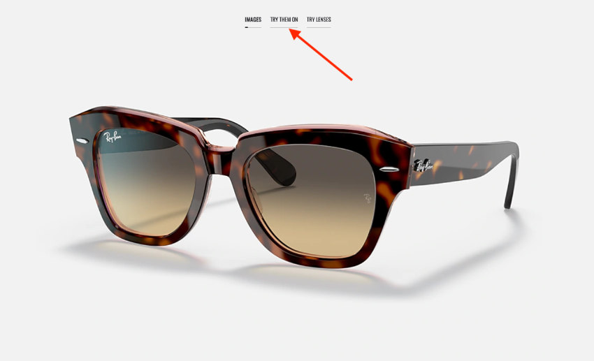
Headquartered in Milan but founded in the United States, Ray-Ban has become synonymous with luxury eyewear nowadays. More importantly, they were among the first companies to incorporate augmented reality in their product pages.
The mechanism is rather simple, choose a model of glasses you like, click the “try them on” option, and after your camera turns on, you will see your face with the glasses on. This saves a lot of time for shoppers who can virtually try on hundreds of models in a matter of minutes, thus assuring they have selected the best-looking pair of glasses.

Burberry
When Burberry launched its Olympia bag, the product page came with an interesting feature.
Namely, when shoppers click the “explore in AR” feature, they are provided with a QR code they should scan using their smartphone.
A statue of a Greek goddess comes to life and walks around their home with the preselected bag. The best thing about this surreal experience is the ability to take a snapshot or record a video to share with friends.
Keller Williams
The world-famous technology and real estate franchise from Austin, Texas is one of the best examples of how real estate agencies can take buyers on virtual tours. Although they were popular in the past decade, virtual tours of houses and apartment really took off during the 2020 coronavirus pandemic.
Prospective buyers just need to select a property they are interested in and they are immediately “flown” inside it. Before their eyes a 2D blueprint of an apartment/house comes to life. Once you add the realtor’s advice and the image gallery, folks can now purchase a desirable piece of property without ever setting foot inside it!
Amazon
Shopping for furniture is enjoyable for most homeowners but it involves a lot of preparation, namely, measuring. However, you can forget about the tape measure if you decide to furnish your home using Amazon’s augmented reality.
The Amazon app comes with a “view in your room” option that allows you see in virtual reality how a piece of furniture would fit inside your room. Apart from the scale, the feature is useful when it comes to pairing up the colors and materials with your room’s décor.
An interactive product page on a shopping platform is tenfold more likely to result in a sale than an item displayed on a store shelf. Shoppers have the opportunity to watch videos of the product in action, rotate them by 360° and ultimately, get a lifelike feel of inanimate objects through augmented reality.

 Return to Previous Page


