Show:
8 Ironclad Strategies to Bolster Your Conversions
Having TONS of web visitors are great, but if none of them take out their wallets and buy your products, everything would be for naught.
After all, you can’t pay your bills with views. You need cold, hard cash.
To help you convert your web visitors into paying customers, we’ll share with you eight tried and tested tips that seasoned conversion rate optimization experts use.

1. Target keywords with the right intent.
Target keywords with the right intent so you can rank high on search results and attract traffic that are ready to purchase.
Use tools such as Wordtracker to uncover the right keywords. I typed in “fine linens” and got these results:
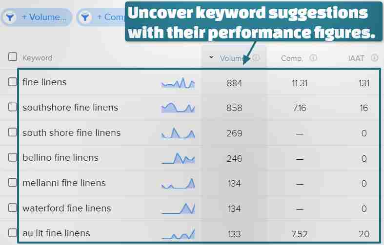
Wordtracker lists suggested key phrases with their average number of searches in the past 12 months, competition level, and number of webpages keywords appeared in anchor and title (IAAT) texts.
Choose keywords with high volume but low competition, such as “southshore fine linens” in the example above.
Discover and integrate the right keywords with tools such as Wordtracker to create conversion-focused content, webpages, etc.
2. Showcase testimonials and user reviews.
BrightLocal’s 2019 survey results show that 76% of respondents trust online reviews as much as recommendations from family and peers.
The figure highlights how displaying testimonials and other user-generated content boosts your brand trust and influences their purchasing decisions.
Exhibit customer testimonials and reviews in noticeable areas of your homepage like Nerdwax did:

Showcase reviews by famous brands, magazines, and celebrities as well, as exemplified by Master & Dynamic:

Establish your credibility and persuade visitors to respond to your CTAs with testimonials and reviews.
3. Present eye-catching CTA buttons.
Create eye-catching CTA buttons to urge your customers to take your offers.
Use attractive colors complementing your background, larger font sizes, and short and actionable texts. Place your CTA buttons above the fold and remove distracting elements.
Additional tip: Use imperative phrases starting with action verbs in your CTA.
For instance, if your blog post talks about how to become a life coach, your CTA can be “Become a life coach now.”
For instance, if you’re hosting and promoting a virtual summit, your CTA can be “Sign up now to our online event now to get early and exclusive access.”
Also, surround your CTA buttons with plenty of negative space to emphasize them.
Here’s how Freshdesk displayed its CTA buttons on its homepage:
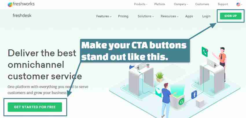
The platform used green hues (complementing the overall design), readable font styles, and active verb phrases and placed the CTA buttons on the top right and bottom left sides.
Freshdesk even put lots of white space around the buttons and used light tones for its cartoon, so it doesn’t compete with the CTA elements.
Whether on your homepage, landing page, or others, eye-catching CTA buttons direct your visitors’ attention to conversion-focused aspects and help increase your click-through rates.
4. Create product explainer and demo videos.
Statistics reveal that videos on landing pages help increase conversions by 80%, and demo video viewers are nearly twice more likely to buy than non-viewers.
Leverage videos’ conversion-boosting power and publish product explainers, tutorials, interviews, demos, etc. on your website and social media.
Use the best video interviewing platforms and other types of video production software to get excellent resolutions and editing effects.
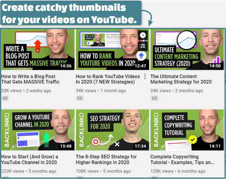
When posting on YouTube, create attractive thumbnails and integrate target keywords, cards, CTA buttons, and other conversion-focused elements.
Check out this example by Backlinko:
Then, instead of uploading your videos, embed them on your website to save space, like Birchbox did:
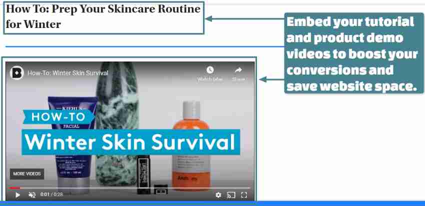
These tutorial videos show consumers how to use your product, providing them with value and compelling reasons to purchase, avail your deals, and more.
Also, creating videos can take a huge chunk of time and effort. Use a reliable marketing project management software to streamline your video creation process — from planning to implementation.
5. Display pop-ups smartly.
Display relevant pop-up offers at the perfect time to increase your conversions.
Try these kinds of pop-ups:
- Entry pop-ups instantly appear when your visitors land on your site.
- Delayed pop-ups come out after your visitors spend a set amount of time on your site or webpage.
- Pushdowns pop up on top of the webpage and push the content downwards. Pushups, on the other hand, slide up from the bottom of the screen.
- Exit-intent pop-ups appear when your visitors show hints of leaving your website. Use these to try to convert them with last-minute discounts, freebies, and other offers.
- Sign-up forms invite visitors to subscribe to regular content (such as newsletters) and other free digital resources, such as e-books, research papers, and more.
To maximize these pop-ups for your conversion goals, align their creation based on your objectives, specific audience groups, user activity on your site, etc.
6. Exhibit captivating visuals.
High-resolution videos and images entice your visitors to want your featured product.
See this banner photo by Kylie Cosmetics:

Kylie Cosmetics displays a stunning photo of a woman wearing its lipstick, a large, pink Lip Kit text, and less flashy but noticeable “Shop Now” CTA button.
Rolex also posts a jaw-dropping, high-resolution video of its Explorer II watch on its homepage, emphasizing its details and texture.
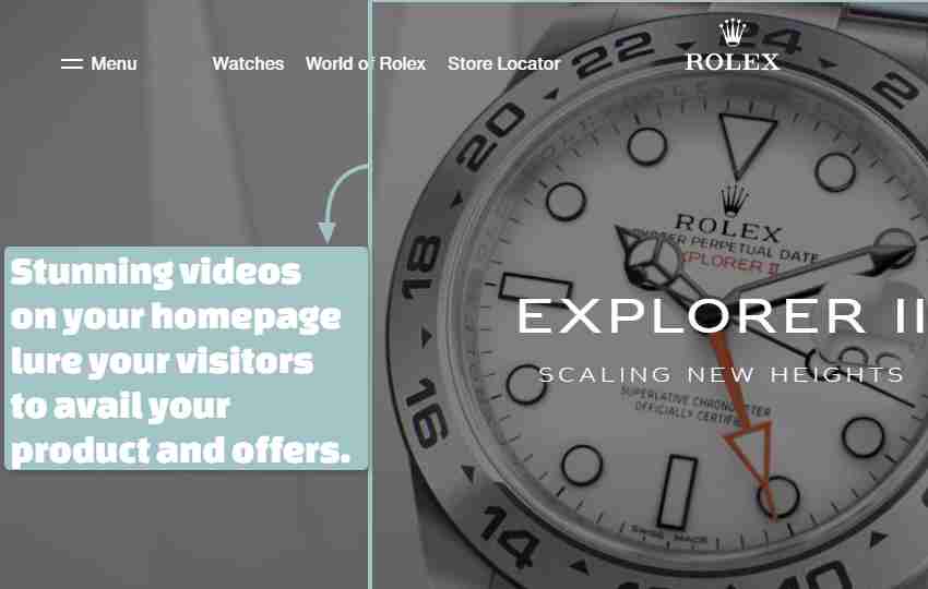
High-impact visuals lure visitors into taking your offer. Display CTA buttons near those visuals so they can immediately process their purchase.
To bolster your visuals’ attractiveness, use reliable graphic design and photo editing tools with various features such as brightness and color adjustments, masking, and an Artificial Intelligence (AI) image background remover.
Streamline your photos’ and images’ production, storage, publication, and other related tasks by using content management tools. These platforms automate functions and help enhance digital experiences in your shop for more quality leads and conversions.
7. Compel customers to commit.
Convert your visitors into paying customers with “yes” and “no” CTAs. Doing this triggers them psychologically to want, select, and commit to their “yes” choice by grabbing the deal.
Optinmonster demonstrates how to do that with its e-book offer:
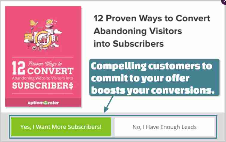
Like Optinmonster, use the first person in your CTAs to influence visitors in wanting and committing to your offer, and a bright CTA button color to attract them into clicking it.
8. Use directional cues.
To further push your customers to take action, couple your CTA buttons with directional cues.
Here’s how Prettylinks did it:
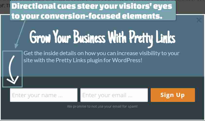
Prettylinks displayed an arrow from the paragraph to the name and email address entry fields beside its “Sign up” button.
Steer your visitors’ sights toward your CTAs with arrows to compel them to notice and respond to them.
9. Build a user-friendly app for your store.
Creating your own app can significantly amplify your brand recognition, online presence, engagement, and, consequently, your sales and conversions.
With your own app, you and your shoppers can quickly interact and transact in one place. Plus, the number of mobile users has risen to over 5 billion worldwide and time spent on these handy devices grew from 188 to 234 minutes in 2021. This shows how much conversion chances you can maximize.
Consider these essentials when building your store’s app:
- Attractive, customer-centered interface
- Smooth navigation, simple checkout, and quick product searches
- Rapid loading speed
- Convenient payment methods
- Consistent branding displays
On a bit technical side:
- Information storage on several databases
- Server and loading capacities management
- Separate server space to avoid crashes
- Customer cache information stored in an individual database
Another critical consideration is your app’s security (typically during and after development). Back up your code and data regularly, especially if you’re making constant updates.
For instance, if you built your app on Microsoft Azure DevOps, run daily, automated Azure DevOps backups. This protects your code from permanent loss that can occur due to system failures, ransomware, accidental deletions, etc.
By keeping instant code and data duplicates, you can be sure your assets are always safe and your business extra-resilient (should incidents happen). You’ll also free up your attention for conversion-boosting activities instead of this tedious task.
Ready to bolster your conversions?
Implement these and other techniques to see your conversion rates soar sky-high.
Be creative in applying these tips, test them regularly, and enhance them according to your performance data and insights. In time, you’ll see terrific results for your conversion efforts.
Got more conversion-boosting tactics in mind? Leave your answers in the comment section below and share this post. Cheers!

 Return to Previous Page


