Show:
Exploring Different Website Layouts: A Comprehensive Overview
July 11, 2023
 Web development
When it comes to creating a website, one of the crucial decisions you’ll need to make is choosing the right layout. A website layout encompasses the arrangement of various elements, such as navigation menus, content sections, images, and calls to action. The layout you choose has a significant impact on user experience, readability, and overall aesthetic appeal.
To explore this further, we will dive into different website layouts and provide a comprehensive overview to help you make an informed decision for your next web design project.
Understanding the Importance of Website Layouts
A well-designed website layout is essential for creating a positive first impression and engaging users. It helps organize content in a logical and visually appealing manner, allowing visitors to navigate your site easily and find the information they’re seeking.
The right layout can also enhance the readability of your content, optimize conversions, and improve overall user experience. With that in mind, let’s dive into some popular website layout options:
The Single-Column Layout
This layout is clean, minimalist, and easy to navigate. It presents content in a single vertical column, making it ideal for websites that prioritize simplicity and focus on storytelling or long-form content.
The single-column layout provides a seamless reading experience and works well for blogs, portfolios, and personal websites.
The Grid Layout
The grid layout is a versatile option that arranges content into a grid structure, typically with equal-sized or proportional columns. This layout is commonly used for showcasing products, portfolios, or image-heavy websites. The grid layout allows for easy scanning and browsing, creating a visually appealing and organized presentation.
The Magazine Layout
Inspired by print magazines, this layout is characterized by multiple content blocks of different sizes arranged in a dynamic and visually captivating manner. It works well for content-heavy websites, news portals, or blogs that feature a variety of articles or multimedia content.
The magazine layout offers a visually engaging experience and encourages exploration and discovery.
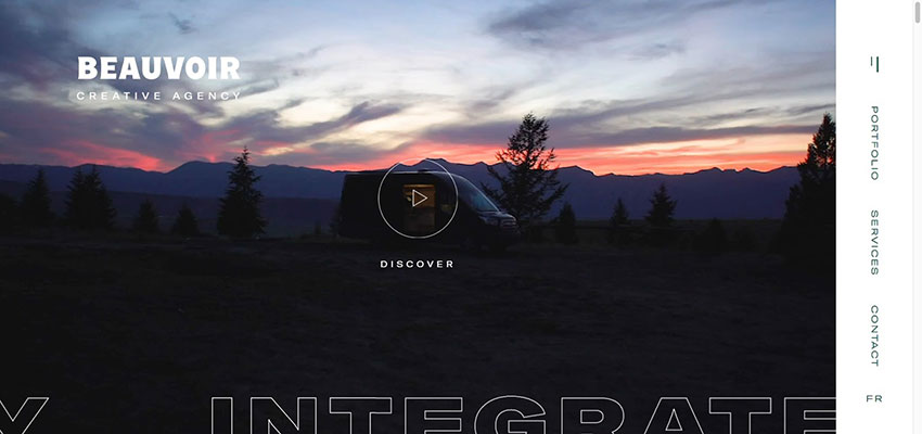
The Full-Screen Layout
With the rise of large screens and high-resolution displays, the full-screen layout has become increasingly popular. This layout utilizes the entire screen space, creating an immersive and impactful visual experience. It is often used for showcasing visually stunning images, videos, or portfolios.
The full-screen layout allows for a high-impact first impression and captivates visitors from the moment they land on your site.

The Card-Based Layout
The card-based layout has gained popularity with the rise of mobile devices and responsive web design. This layout arranges content into individual cards, resembling virtual index cards. Each card contains a specific piece of information, such as an article, product, or image, making it easy for users to scan and interact with the content.
Card-based layouts provide a visually appealing and organized presentation, allowing for flexibility in arranging and rearranging content.
The Multi-Page Layout
While many websites opt for a single-page design, the multi-page layout remains a popular choice, especially for larger websites or those with a significant amount of content. This layout separates the content into distinct pages, with each page focusing on a specific topic or category.
The multi-page layout enables the deeper content organization and allows for better SEO optimization through the use of targeted keywords and individual page titles.
The Hero Header Layout
The hero header layout places a large and visually captivating image or video at the top of the website, immediately grabbing visitors’ attention. This layout is particularly effective for websites that aim to convey a strong visual brand identity or showcase a specific product or service.
The hero header layout sets the tone for the rest of the website and creates a memorable first impression.
The Parallax Scrolling Layout
Parallax scrolling involves the background and foreground of a website moving at different speeds, creating an immersive and dynamic visual effect.
This layout adds depth and interactivity to the website, engaging users as they scroll through the content. Parallax scrolling is often used to tell a story or guide users through a specific narrative, making it popular for storytelling websites, portfolios, or landing pages.
The Fixed Sidebar Layout
This layout keeps a sidebar fixed in place while the main content scrolls. The fixed sidebar typically contains navigation menus, search bars, or important calls to action, ensuring that they are always accessible to users.
The fixed sidebar layout works well for content-heavy websites or blogs, as it allows users to easily navigate through different sections while keeping key elements within reach.
The Asymmetrical Layout
For those looking to break away from traditional designs and create a visually unique website, an asymmetrical layout is an excellent option. This layout plays with unconventional alignments, varying sizes, and overlapping elements to create a sense of creativity and modernity.
The asymmetrical layout is popular among design studios, creative agencies, and portfolios seeking a distinct and memorable visual presence.
Leverage the Best Layout Styles for a More Impactful Website
Choosing the right website layout is crucial for creating a visually appealing, user-friendly, and engaging website. By understanding the different layout options available, you can select the one that best aligns with your website’s goals, content type, and target audience.
Whether you opt for a single-column layout for simplicity, a grid layout for showcasing products, or a magazine layout for content-heavy sites, each layout offers unique advantages and aesthetics.
Remember to consider factors such as readability, ease of navigation, and responsiveness across various devices when selecting a layout. The layout you choose should enhance the user experience, highlight your content effectively, and reflect your brand’s personality and identity.
Ultimately, the website layout you choose should align with your overall design goals and cater to the needs and preferences of your target audience. Don’t be afraid to experiment and combine different elements to create a layout that is both visually appealing and functional.
Keep in mind that the world of web design is constantly evolving, and new layout trends may emerge over time. Stay updated with the latest design trends and user behavior to ensure your website remains fresh, modern, and relevant.
Ultimately, exploring different WordPress website layouts is an exciting journey that allows you to unleash your creativity and create a unique online presence. Consider the purpose of your website, the type of content you will showcase, and the user experience you want to deliver. By selecting the right website layout and implementing it effectively, you can create a visually stunning and user-friendly website that leaves a lasting impression on your visitors.
 Return to Previous Page