Show:
Newsletter Design Trends That Should Hit Your Customers Inbox This Year
If you decide to embark on the creative process of designing your newsletter on your own, you need to take a look at the most exciting newsletter design trends this year. Just read on!
Mixing up some old and new marketing tools can bring exciting and promising results to businesses. A well-constructed digital marketing strategy can reach an enormous audience cost-effectively and measurably, thus offering companies countless possibilities to evolve and secure profit. And a vital component of any successful marketing strategy is email marketing. In particular, email newsletters. They are a fantastic tool to generate more leads, send traffic to your website, and announce new products.

Newsletters are also an excellent way to boost social media following and the most cost-effective way to build and maintain a connection with your audience. Yet, writing good email newsletters that people read is not easy. It requires time and expertise. Now, if you don’t have time to create the designs for your company’s newsletters, or the whole email marketing strategy, an agency providing digital marketing services is your best bet. Professionals can support you and your business by quickly conceptualizing, strategizing, and executing your marketing campaign.
1. Minimalistic and monochrome newsletter design
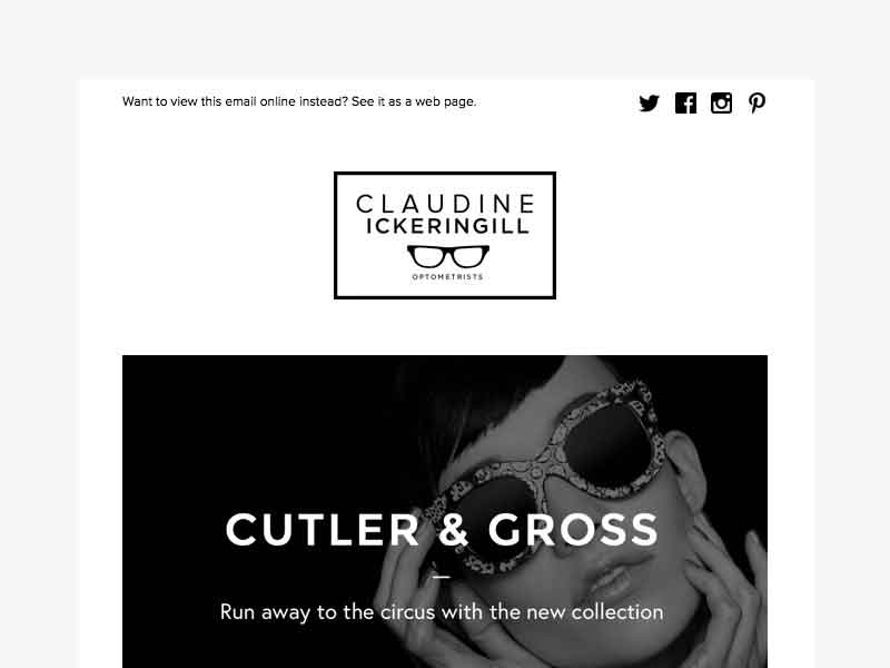
In newsletters, as well as in emails, lots of white space, and monochrome designs are remaining trendy in 2020. The idea behind these types of designs is for the newsletter to be easy to read and to convey the purpose of the content it carries clearly. Minimalistic designs cut through the noise and encourage the reader to take action without any overwhelming design elements.
When it comes to monochrome design, it made a comeback in 2019 and continues as a trend in 2020. A surefire combination is a black and white palette. It goes perfectly when the idea is to create striking contrasts because it makes the other elements of the newsletter stand out. For additional insights and extra inspiration, take a look at these free newsletter templates for your next campaign.
2. Try infographics instead of photos
Most of the newsletter readers are usually only skimming the emails they get, instead of reading them in-depth. It is understandable since we get a significant number of emails per day. To make it eye-capturing and more engaging for the audience, use creative infographics instead of photos in your newsletter. Infographics are not new, but they are our favorite trend that continues in 2020 since they capture attention and offer summarized information. This way, even if your followers are scarcely scanning your newsletter, they will get the information and full value from it.
Check out Creative Fabrica to obtain incredible infographic templates!
3. Spice it up with interactivity
Interactive content in newsletters is among the hottest email newsletter trends. The reason is simple – it engages people in dialogue. It also creates a personalized experience for the users, thus bringing lots of benefits for your brand. However, when using it, the interactive content must be a built-in element of your newsletter, meaning it has to invite for some actions within the message without leaving it. The interactive part can be the CSS-animated button for promo emails, survey forms for event-triggered emails, quizzes, videos to present a new product, or to congratulate customers on holidays.
4. Broken layout grid in newsletter design
The irregular or broken layout grid is becoming more and more popular these days. In this newsletter design, elements are positioned in a non-linear way making the newsletter unpredictable and exciting. It builds curiosity and demands attention, which lures your subscribers to engage with your content. The broken or irregular layout grid is a fearless way to interact with your audience.
5. Splash of contrasting colors
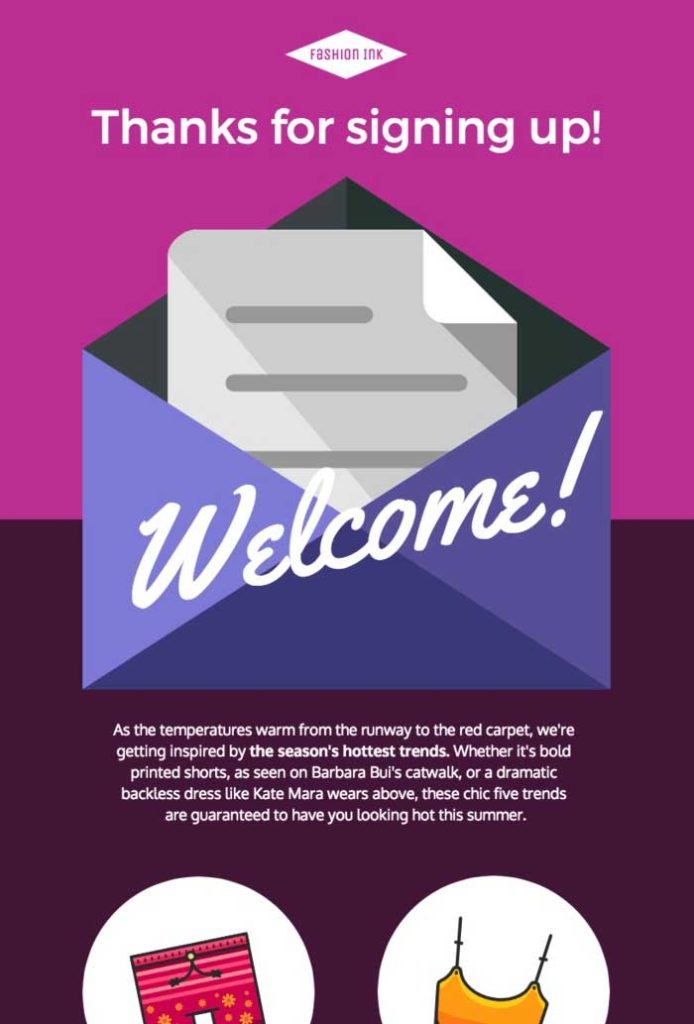
Vivid colors such as purple and yellow have kicked the newsletter design game up a notch. Their original idea is to catch the audience’s attention to your emails. However, if you decide to go for a bold colored template, make sure the color palette of your choice corresponds to your business philosophy.
6. Bold fonts for highlighting
Another interesting trend this year is a bold font that is difficult to ignore when it hits your inbox. There is no need for too much explaining here, only to use it wisely. When deciding to create a newsletter with bold fonts, pay attention to highlighting the header (that brings you into the email) and the offer with striking fonts. With this easy hack, you put the reader in the right state of mind before they read all the other information.
7. Achieve more depth with 3D illustrations
Not a new trend, but not less hip than before – 3D graphics! Particularly in contrast to the flat design of the newsletter, the three-dimensional graphics give the emails more depth! The imagery will lure the reader, increasing your chances of getting a customer interaction.
8. Animation 2.0 in newsletter design
Animating emails using gifs was undoubtedly one of the top trends in 2019. There are now various ways in which this trend can also be transferred to the 2020 newsletter design trends. The APNG (Animated PNG) format gives the familiar GIF format more colors and enables the display of transparencies. In this way, popular animations can be implemented at a completely new quality level.
9. Suitability for dark mode
According to recent studies, dark mode helps a user’s eyes relax, so no surprise that many people with light sensitivity or night shifts find it more convenient. From a designer’s point of view, this design allows users to focus on what they’re reading. So there are two good reasons why this design is increasing in popularity. This trend also brings a lot of technical challenges – images and logos should be handled with extra attention. Namely, the image colors should contrast against both white or dark backgrounds equally. Also, JPG images may need to be switched to PNG or SVG with transparency to avoid readers seeing white boxed images on a dark background.

10. Personalization by using AI
Personalization, through the integration of artificial intelligence into the creation and distribution of newsletters, is also a defining newsletter trend in 2020. Artificial intelligence, even though still in its infancy, can be of great use in optimization and making predictions. Drawing from a wide range of consumer information, AI will be able to generate newsletters with tailored content and determine the optimal delivery time for individual recipients. That will yield a beautiful email that looks and feels like a personalized message.
Conclusion
Throughout the year, there are plenty of opportunities to use your email marketing to increase customer engagement. When it comes to using newsletters as a tool for that, keep in mind that the trending designs this year focus on dynamic and interactive content that can be used to inspire your readers. However, before you start curating your newsletter, take a look at some best practices on how to send effective email newsletters. That will help you decide how you want to display your content, taking your business into consideration first and foremost.

 Return to Previous Page

