Show:
Website Design Best Practices For Businesses
February 14, 2023
 Web development
Today, the only way to increase outreach is by shifting your business online. You need a digital presence to cover all demographics of your target audience.
Your website is the first impression your audience gets about your product or services.

If it were a brick-and-mortar store, you would ensure the aesthetics are as beautiful as the user’s experience when they stroll across your shop.
Say you are a cafe owner. You would ensure every brick is in the correct place, design, and color. You would want the entire cafe to have a unique and consistent brand identity.
Congrats, the hungry customers enter the inviting cafe. They approach the seats to sit comfortably and order the gobsmacking items on the menu.
You took a minimalistic approach to the furniture and made them hard to sit on. The hungry customers hop immediately to the cafe right next door.
Don’t let the customers bounce from your website the same way. The experience is as necessary as the interface design to onboard your users.
There are plenty of tools to build and host websites, making it easy for every business owner to customize the website design by themselves.
But not sure where to start? Optimize your digital applications to meet these three basic needs of form and functionality, and you will be able to build a loyal and trusting user base.
Brand Consistency
When you see a red logo with a yellow “M” inside, you immediately know which company I’m talking about.
From toddlers to boomers, everyone loves a McDonald’s burger. Apart from the logo, you also associate the yellow and red clown with McD.
Every merchandise, digital app, store look, and feel are all on this color scheme, which should be the case with your websites.
UI elements
You can ensure brand consistency through the User Interface elements such as — Colors, typography, button shapes, icons, illustrations, infographics, and animations.
- Colors — Think hard and pick precisely two to three colors to represent your brand. Use that as your primary colors and tones of the primary colors as your secondary and tertiary colors. Restrict the tones to a maximum of five to ensure consistency.
- Logo — Use the primary colors and typography in your logo. Keep the design minimal so that it gets retained in a person’s memory within five seconds of viewing it and replicable almost to perfection.
- Tone — Decide the feel and intensity of the product and apply it across all UI elements. Use popping colors like orange for the light-hearted industry and a young audience, blue and green for finance apps and the older audience, and distinctive yet sober colors for the color-blind users.
Responsive and Adaptive
- Most of the world accesses the internet through handheld devices, such as mobile phones. A significant reason is how there is a need for everything to be achieved in an instant.
- Keep in mind the real-estate restriction you have on mobile, and design the website accordingly with white spaces, no margin bleeds, and concise content.
Placements
- As much as you can, keep the placement and behavior of UI elements and features on a screen the same across all devices — Buttons, search bar, text alignment, navigation elements, user flow, and so on.
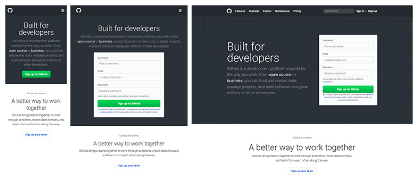
- When Github moves from desktop to mobile, the single-column layout neatly folds into a double-column structure where the text on the left intuitively places itself above the sign-up form.
- You can also remove the form on mobile and retain only the essential elements, such as the primary CTA button, which executes the same function as signing up. It helps keep the layouts clean and perform the function equally well.
Intuitive Navigation
Websites are a long-standing digital product that has established user experience rules based on years of research on human behavior.
It is best to stick to the human conceptual models. One of the critical goals of a website is to help users execute an action towards their intended goal in the quickest way possible, which can happen when the learning curve is minimal or zero.
For instance, the header on an e-commerce website always has a set of drop-down menus of the primary categories, a search button, and a profile icon to access personal account settings. Why not do the same for your website instead of reinventing the wheel.
Guided Tutorials
- You can get new users on board by highlighting every feature on the home page. If it is a dashboard, show them what information each tile provides and the actions they can perform by clicking into the tile flow.
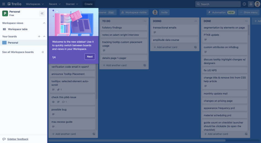
- You can do this through swipeable welcome screens, which tell them the app’s core functionalities. Breadcrumbs are secondary navigation that informs the user of their location on the app and how they reached there, and tool-tips in the form of pop-ups and modals like Trello.
- It tells the user that they are currently viewing the sidebar, the contents you can access like workspace table and boards, and that you can switch between panels and view from here.
Language
- If it’s a global audience, use simple language that all can understand. Do not forget to consider the geographical norms of your target audience, which may require you to refine and eliminate offensive text.
- If it is a targeted audience, use some native slang to connect more and make them comfortable on your platform.
- If the audience uses the word “buy” as opposed to “purchase,” it would make more sense to use “buy” to ease users into knowing the action that particular button will perform when clicked.
Personalization
Doesn’t it feel great when you feel like the dress is just for you? It fits you perfectly, enhances your figure, and makes you feel confident wearing it.
Your website must do the same for your users. You can do this by personalizing their user experience.
It can sound outlandish trying to predict what every single user’s intent is on your platform, but not quite when you can directly get the answers from them.
Forms
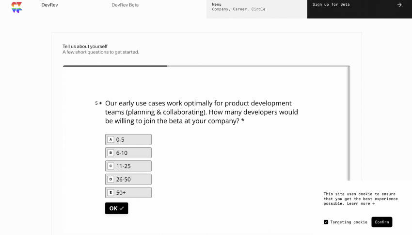
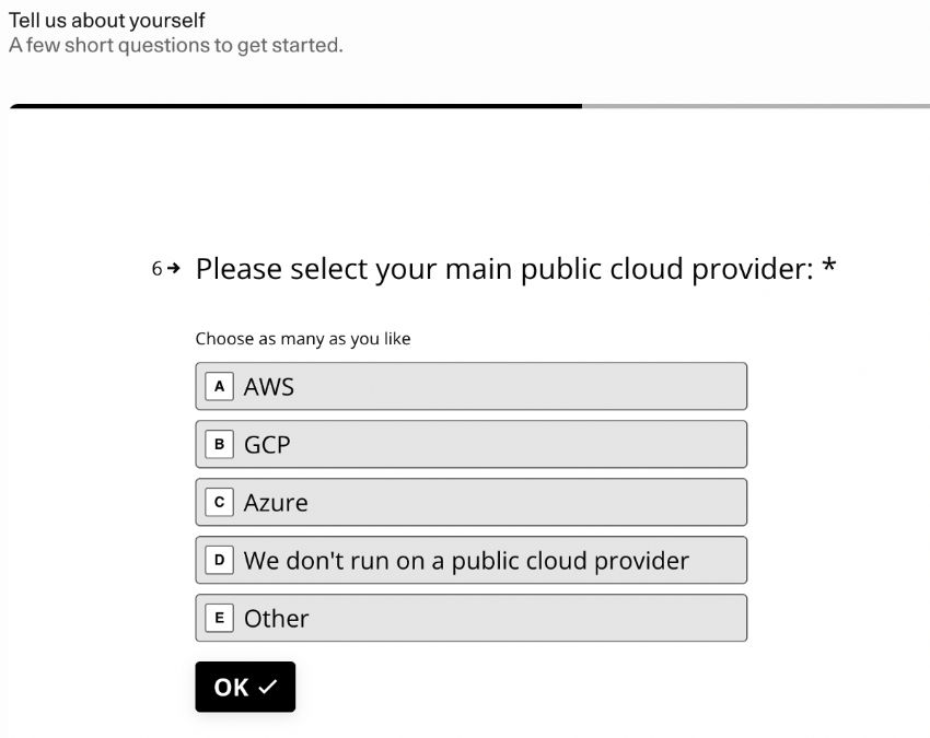
- While onboarding a new user, study user behavior through learning their intent and goal on your website. You can do this in your onboarding process through welcome screens.
- Ask a set of questions, a maximum of five, which will help you categorize your audience type. For example, DevRev is a tool for startups and established organizations both. By making the user select a category, you can ask follow-up questions and customize the dashboard for them.
- If it is a startup, the next question asked is the organization’s size. The follow-up question asks them to pick their industry, which then helps DevRev provide blogs, videos, and resources related to that particular user persona.
Cookies
- Provide timely and situational information to help users achieve the intended goal by studying their behavior on your platform.
- Suppose a user visits the shopping category of Beds. In that case, you can suggest add-ons like pillow sets, bed covers, mattresses, and other related items to help smoothen their shopping experience.
- Cookies also help analyze the performance of your website through traffic, bounce rates, new user onboarding rate, churn rates, and other statistical data.
Final Thoughts
Suppose you are keen on learning more about the guiding principles for an incredible and converting website. In that case, you can refer to the Human Interface Guidelines for iOS devices and Material You Guidelines for Android devices.
 Return to Previous Page