Show:
A Quick Guide to Speed Up Your Image Heavy Website
Everyone knows how important it is to have images on your site. With images, site owners can add value and interest to their content. However, images come with the added baggage of larger file sizes.
Because of this, image optimization has become a necessary step for modern websites. In this digital age, a business cannot stay competitive if they lag behind in certain developments.

Why is it important to optimize images? The problem begins when we use images that have very good quality. This is because high-quality images will use up a lot of space and take more time to load.
These two problems will only bring your site down. Larger file sizes could be the reason your site’s performance suffers. As for page loading speed, the increased sizes mean users have to spend more time waiting for your images to load.
To help you get started with your image optimization, we’ve come up with a summarized step-by-step solution.
5 steps to speed up your website
1. Don’t underestimate your thumbnails
Thumbnails are one of the most ever-present tools in site design. They’re essentially tiny versions of the title image and offer users a glimpse. They apply a variety of purposes; most notably, e-commerce websites use a ton of these on their product catalogs.
Image thumbnails are a deceptive bunch. On the surface, they’re tiny and don’t seem to need much detail. The thing is, some site owners forget that just because they look tiny doesn’t mean they are tiny.
Never forget to optimize these images. This is an even higher priority if you’re an e-commerce site like Amazon or eBay.

Make it a habit to check on your image files every once in a while. Sometimes, with all the things that go on, mistakes might slip by. It’ll be much more beneficial if you take some time regularly to check on these details.
2. Adjust your image dimensions to their purpose
With that being said, you’d gain a lot from scaling all your images appropriately. To put it simply, this means changing the dimensions of the image itself to adapt to the situation.
In this way, you can be sure that each image won’t be taking up more space than it should. Addressing this can be done in different ways.
For site owners creating their images, you’ll probably have a photo-editing software on your computer. Professional photo-editing software will have a function that allows you to scale the images right off the bat.

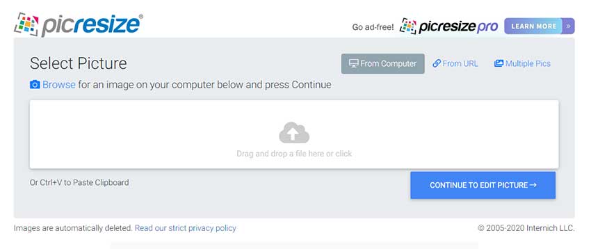
Alternatively, there are a couple of online tools that do this service for free. Take PicResize as an example. This is a website that lets users upload a photo for online editing, cropping, and resizing.
3. Make sure your files are compressed
File compression isn’t a new concept. It’s done through algorithms that tell a program which data to get rid of and which to leave untouched. It’s a clever way of decreasing the footprint of each file.
Compression has been used for both source files and images in web development. Users of WordPress might have an easier time with this. That’s because there are plugins purpose-built for amateurs and professionals alike.
Of course, outsourcing to a web design firm will guarantee this kind of file treatment. That’s because professional teams will have a list of conditions to satisfy before finishing a website.
For those doing their own developing, don’t fret. Web developers from all over have come up with a variety of free programs to allow users efficient file compression.

4. Pay attention to the file type of your images
Images are used for various purposes. Some images are used for banners while others are relegated to the role of thumbnails. What this means for you is that you are dealing with images with different properties.
What do we mean by this? Well, the purpose of the image should be a factor when deciding the image file type. That’s because each file type will have its own set of pros and cons.
It would help if you can get yourself familiar with the diverse options and their applications. To help you out, we’ve summarized the main characteristics and usage of the 3 most common file types.
| File type | Characteristics | Use for | ||
| — | — | — | ||
| JPG/JPEG | | | Lossy, versatile most commonly used scaled compression | | | Artwork photographs |
| — | — | — | ||
| PNG | | | Loss-less may display millions of colors increasing popularity as standard web format. Simple images yield tiny file sizes | | | Elements that need transparency simple images with fewer colors images that can be simplified |
| — | — | — | ||
| GIF | | | Loss-less allows for animated images can be compressed for lower file size | | | Page banners, email advertisements, any element that needs animation |
It comes down to what you need your images for. Let’s say you want to put up a blog about photography. Based on the table above, that means you’ll be looking at JPG files rather than PNG.
You can also visit Convertjack to convert your images from one file type to another. These services can handle JPG, PNG, GIF, and even WEBP files, so you’re covered no matter what format you need.
5. Don’t sacrifice practicality for aesthetics
Lastly, this step acts as more of a maintenance guide. Of course, it pays if you keep at it as compared to just leaving it after you post it. Owning a website isn’t meant to be like that anyway. It takes some patience and diligence to be competitive.
On that note, we’d highly advise prioritizing your site’s performance and practicality. Yes, images are important for the overall design of the website. That doesn’t mean you should be using too many of them.
Find the balance between aesthetics and functionality. Your images should not only look pretty but also contribute to your site’s overall impact.

Take BlueReceipt as an example. This site uses 3D elements on its homepage. Despite that, the site maintains a short page load time. This is because they balanced the use of “exciting” elements with a “plain” background.
As with many things, finding and maintaining that fine line should be the priority. Overcomplicating or overcompensating will have negative effects on your site’s impact and attractiveness.
Conclusion
There you have it, a simplified way of approaching image optimization. It’s not as complicated as some people make it out to be. The trick with this is keeping an eye out for every small detail.
Admittedly, it takes some getting used to. It can be so easy to miss these steps when building a website sometimes.
The key here is to remember how this benefits you. Optimized images mean your site performs better. This, in turn, means site users load fewer files, increasing the page’s loading speed. Finally, with faster speeds, you can expect an improved rank with Google’s search algorithm.
At the end of the day, it’s about what kind of message you want to be able to send with your site. While images are important, the information they’re complementing should still be the most important factor.

 Return to Previous Page


