Show:
How to Create a High Converting Landing Page
If you also want to promote your product with the help of the landing page, you are heading in the right direction. Now it’s time to learn the basic rules, which will help you to design high-converting landing pages.
The landing page is a powerful marketing tool, which helps to increase conversions. Companies from all over the world use it to boost their efforts and achieve specific business goals.
Create high-quality textual content for your landing page
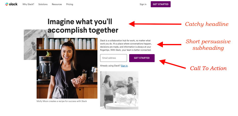
If you want to create a high converting landing page, you should start with crafting textual elements. The first step you should take is to come up with an original, engaging and easy-to-remember headline. It should grab the visitors’ attention and make them stay on your page for longer.
The second step is to add a subheading, which briefly explains what your product/company is all about. A subheading should contain 1-3 short sentences, which will persuade users to scroll the page down and learn more.
The next step is to provide your target audience with the answers on the following important questions:
- Which client’s needs will your product satisfy?
- What benefits will users get?
- What specific features does your product have?
- What do your past customers think about your product?
Don’t forget that you should create content with UX principles in mind. Try to express your ideas as briefly and clearly as possible. If you lack writing skills, feel free to utilize the following services:
- FreeEssayWriter. Use this service to get help from professional UX writers. They will assist you with writing a high-converting headline and subheading.
- FontShop. Check this platform to find original fonts, which will make your textual elements visually appealing.
- OnlineWritersRating. Visit this website with reviews to find a reliable service, which is specialized in landing page content writing.
- Grammarly. Use this tool to proofread every piece of textual content. It’s important to ensure that your landing page is free from any spelling errors and typos.

Add catchy visuals to your landing page
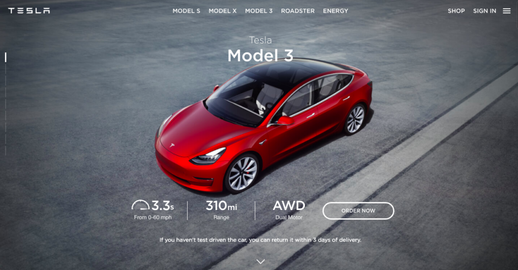
The human brain processes visual information in 60,000 times faster than text. For this reason, it’s important to use not only textual content, but also images, videos, infographics, and other visuals. It will help to strengthen a core message of the landing page and, consequently, raise the conversion.
Choosing a visual element for your landing page, make sure that it meets the following criteria:
- It’s large in size, yet light-weight
- It’s relevant to the product, which you promote
- It has a descriptive name
- Its resolution is high

Boost loading speed of your landing page
Keep in mind that the landing page should have a functional design. Don’t overload it with the images, CTA buttons, or widgets, which don’t add any value. Otherwise, the webpage will work too slowly and bounce rate will be too high.
“A fast page load time is key to success. Do your best to your landing page work smoothly on the desktop and mobile devices, and your efforts will be rewarded with high conversions,” – says Veronica Wright, CEO of ResumesCentre.
Design a powerful CTA
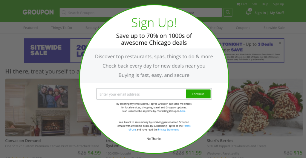
Probably, one of the most important elements of a high-converting landing page is a clear and powerful call to action. So you should try to find the right words, which will encourage visitors to click the CTA button. Just remember that your primary task is to make people believe that they should try your product right here and right now. Designing a CTA button, you should pay attention to every small detail. The font, word choice, size, color and shape of the button – everything influence the conversion rate.

Run A/B testing
“There is no limit of perfection. And even if you believe that your landing page works effectively, you can always find a way how to improve it. All you need to do is to run A/B testing,” – states Leona Henryson, UX designer at Essaysupply.com.
You should test only one element of design at a time. For instance, you can check whether Calibri font works better than Arial, or whether blue CTA button brings more clicks than a red one.
Wrapping up
As you can see, it’s not that hard to design a high-converting landing page, if you are attentive to details. However, if you believe that you lack some skills to cope with this task on your own, feel free to get help from the experts in the field. Professional UX writers, marketers and web-designers will assist you with landing page development, and you will easily hit your marketing and other business goals.

 Return to Previous Page


