Show:
5 Landing Page Design Tips You Should Follow Today
In the competitive global environment of today, it is difficult to grow your company and achieve success in business.
Using your marketing tools and strategies effectively is more powerful than ever, and you stand to lose more than ever if you make too many mistakes.
Your landing page is extremely important to the success of your business. It is the first page that a visitor sees when they click on your organic or paid traffic link.
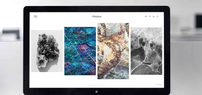
Even your primary homepage can act as a landing page — and it’s essential that it drives conversions efficiently.
In this article, we will discuss several design tips for your landing page. These will help you communicate your sales and marketing messages in a way that connects with your audience and drives more leads and sales.
Let’s get started!
Landing Pages 101
If you are new to creating landing pages, then it will be helpful to briefly review the different types of landing pages and their purposes.
Splash Page
A splash page, as opposed to a typical landing page where a user ends up after clicking on your ad, has a hyper-specific goal to fulfill.
It can verify a user’s age, ask them a qualifying question (for sales purposes), or allow them to select a language preference to enhance the UX (User Experience).
Splash pages are often used before the main website page or sales landing page and are not usually meant to generate leads or click-throughs.
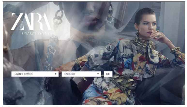
They are best reserved for communicating important information and allowing users to customize how they view your site.
Squeeze Page
A squeeze page is best used to collect a user’s email at the top of your marketing funnel, using a free offer.
For instance, users can use it to get a downloadable PDF with insights into their industry or specific problems they are trying to solve.
Lead Capture Page
These typically involve the same elements as a squeeze page to collect a visitor’s information. However, they are longer than a squeeze page, although not as long as a typical sales page.
They are versatile and can be used to great effect at the middle stages of your marketing funnel.
Be sure to maintain a balance between your offer (a free or low priced information product or another benefit to the visitor) and your “ask” — what you are looking for in return.
This could be an email address, appointment, phone number, or any other manner of moving the sale or conversion forward.
The more you are asking for (the farther down the funnel you want your visitor to go), the more value you need to provide in your offer, or your conversions will plummet.
Sales Page
A sales page will have more detail, be longer, and overall do more work than any other type of page on your website because it is at the bottom of your funnel.
This is where you are actually asking customers to hand over their hard-earned money for your product.
You need a skilled copywriter or marketer to design a sales page that is persuasive and comprehensive without being boring, so that your market is engaged and excited to become a customer.
Keep in mind that a great sales page will contain the following elements:
Headline
Your headline is the most important part of your copy.
It is what you use to stop your prospect in their tracks and get them to read or watch the rest of your sales page and learn about your offer.
Aim to feature the main benefit in your headline whenever possible.
Subheaders
Subheadings are like mini headlines that keep a reader engaged with your sales page.
They should persuade them to keep scrolling and consuming your sales message by featuring secondary benefits, impressive stats, and other eye grabbers.
Visuals
Visuals, specifically images or videos, are powerful emotional tools.
Be sure to include photos or videos of your product or service in action.
Preferably, these images should include a person who represents your target audience. This will help other potential customers relate better to your sales page.
Call to Action
Like any landing page, your sales page will contain a call to action. Only this time, the action you want the user to take will be the biggest “ask” in your funnel — the sale.
For that call to be effective, the user has to come to it already persuaded that your offer is the answer to their pain points.
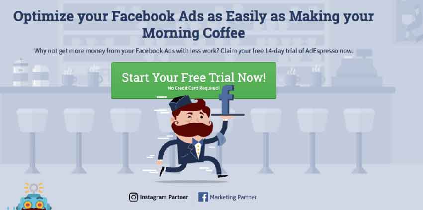
Therefore, the real work of your CTA is not in the CTA itself, but the work you do leading up to it.
Form
Assuming you get someone to click on your CTA to purchase your product, be ready by making it easy for them to buy.
Have an integrated payment platform and pricing information so that there is no confusion about how to purchase from you.
In general, a sales page should be appealing, yet straightforward enough for the user to navigate with ease.
The 404 Page
A 404 page is something you have probably seen before: it is otherwise known as an “error page.”
However, with the right approach, it can be much more than that.
Think of it this way: if a customer lands on an error page, then they are clearly lost due to their own mistake (or yours).
Instead of leaving them in a state of confusion, make them a loyal customer by creating an on-brand 404 page just in case.
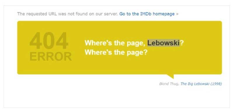
You can do this a number of ways. Some great tips are to use humor, interactivity, and even live interaction via a chat service if possible.
Someone was already interested enough in your product to click through to this page, so you don’t want to lose them due to a technical difficulty.
To engage them even when such errors occur, create a simple and friendly 404 page.
Event Landing Page
A particular type of landing page that deserves attention due to its specific requirements is an “event” landing page.
This is where you will focus on completing a conversion in the form of online registration and attendance to your virtual event.
Such an event is typically a webinar or virtual conference where you can showcase the features and benefits of your product, bring in guest speakers, answer objections and questions in real time, and bring your conversions to a new level.
A great landing page, such as that with a countdown timer to build urgency or vital information about keynote speakers, is an essential part of event planning because it helps maximize attendance, engagement and conversions.
Now let’s get into the 5 design tips that you should be following when creating your landing pages.
How to Design Your Landing Page
Here are the elements you should keep in mind when you design your landing page.
Tip No.1: Loading Time
Visitors these days don’t have much patience. If your page takes longer than a few short seconds to load, then they will often decide to leave.
If they exit your website altogether, you’ll lose that precious new lead, subscriber, or customer.
When this happens, it is called a bounce.
Not only is this bad for your business overall, but it also hurts your SEO (Search Engine Optimization). Google will give you a lower quality score if you have too many bounces.
So how do you make sure this doesn’t happen? There are a few tricks to increase your page speed:
- Minimize Landing Page Elements. Keep heavy graphics and resource-intensive (such as plugins that use a lot of JavaScript) to a minimum wherever possible.
- Check Loading Time and Weight. Use online tools to see exactly how long your page is taking to load so that you can make proper adjustments.
- Compress Graphics and Images. You can reduce the size of your images, or “crush” them so that they still look great without slowing down your page so much.
With these few simple adjustments, your landing page elements will be lighter and your page can go from awfully slow to lightning fast, improving your UX and conversion rates.
Tip No. 2: Selling Points
At the end of the day, a good landing page is like a friendly customer service agent and a skilled sales representative combined into one.
You should clearly state exactly how you can help your customer by focusing on their problems and tying them to your main selling points in the form of benefits.
For instance, if you are selling software that helps B2B companies manage their customer data, a feature might be that it can hold up to 2,000 contacts.
Instead of simply stating the hard facts of this feature, tie it to a benefit — such as being able to prospect for new clients at full speed without disrupting their sales team’s momentum.
In addition, don’t take your product or service features for granted.
If there is something that you do to add value, you should mention it somewhere in your sales message. It can help you stand out from the rest of the competitors in the industry.
Tip No. 3: Responsive Design
Many marketers make the mistake of only creating a desktop version of their website or landing page. When this happens, it becomes difficult for mobile users to access and use your site, decreasing conversions.
Mobile usage is on the rise, additionally compounded by the pandemic, so be sure to use frameworks, website builders, or developers who can help you create responsive landing pages that resize and reposition elements according to the user’s device.
Tip No. 4: Clear CTAs (Calls to Action)
Remember that your customer does not know what you know. They don’t understand how your website is laid out, or what you want them to do unless you explicitly tell them how to purchase your product, sign up, or complete another conversion event.
Your CTAs should be clear by using simple, precise language (such as Buy Now or Sign Up Here).
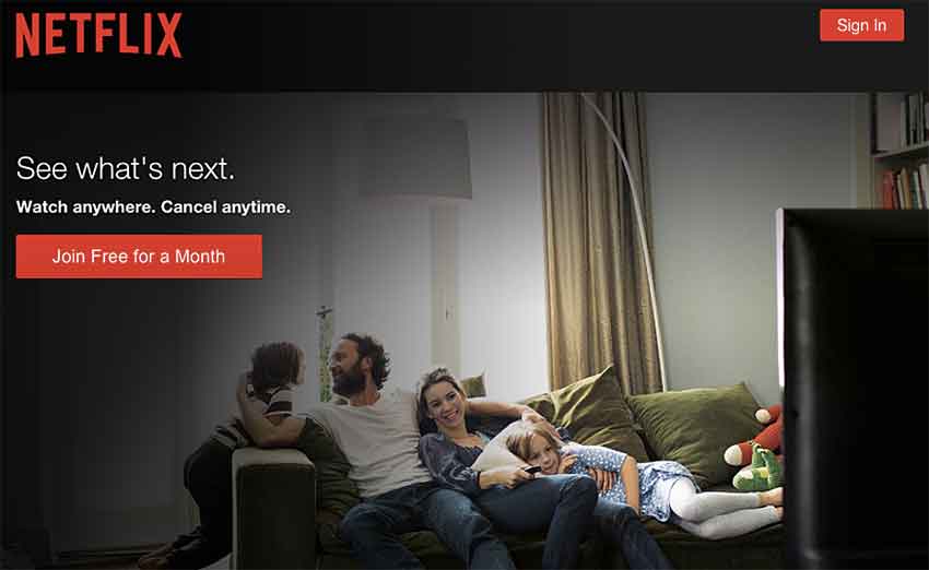
In addition, the size and coloring of your CTA should stand out from the rest of the page. For instance, use a red button with a white background, with other elements being blue.
Tip No. 5: Video and Interactive Elements
One of the most important landing page tips is to keep your audience engaged. Long gone are the days when a simple few lines of text will do the trick.
Instead, leverage modern marketing resources such as interactive buttons and engaging videos.
You can use videos, for instance, to showcase your product in an exciting manner if it is visually appealing.
You can also use videos as a way to produce a high-quality sales pitch that works for you 24/7, helping to convert more customers whenever a visitor hits your page.
Landing Page Example
Finally, let’s look at an example of a great landing page from a company that is growing fast — Asana:
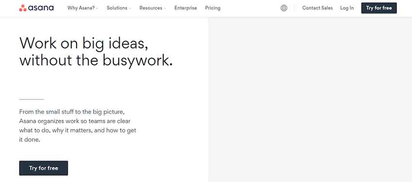
Notice how the layout is simple and beautiful.
Furthermore, you’ll notice how Asana features just one main CTA (Try for Free). They adhere to CTA best practices by making the button stand out and keeping their messaging simple.
For a piece of task management software like Asana, the most important thing is getting users to try it out so that they and their team become accustomed to the new workflow.
Businesses are often hesitant to purchase new software without trying it.
They have a few buttons along the navigation at the top so users can get the information or help they need, but the landing page remains focused on driving conversions in a single-minded way.
Their ad copy tells visitors what the product does and how it can help them, without overwhelming them with data or confusing navigation.
Those visitors who want to know more can always navigate to other areas of the website, but Asana makes it easy to become a user quickly — no doubt increasing their conversions and bottom-line revenue.
Conclusion
If you neglect to follow the right strategies and use the right marketing tools, it is incredibly challenging to get ahead in the business world of today.
That is why it’s so crucial that you understand the place of your landing page in your overall funnel, as well as how to design it in a way that drives higher conversion rates.
With the right landing page design, you can make the most of the traffic that your marketing channels and sales efforts generate.
That way, your business expenses are lower in comparison to your revenue.
Use the tips step by step in this article in a way that aligns with your product or service. It can transform your conversion rates — driving higher profits and income for everyone involved in your business.
About the author:
Michelle Laurey works as a VA for small businesses. She loves talking business, and productivity, and share her experience with others. Outside her keyboard, she spends time with her Kindle library or binge-watching Billions. Her superpower? Vinyasa flow! Talk to her on Twitter @michelle_laurey.

 Return to Previous Page


